
––––––––––––––––
04 — PRACTICE
ARTISTIC PRACTICE
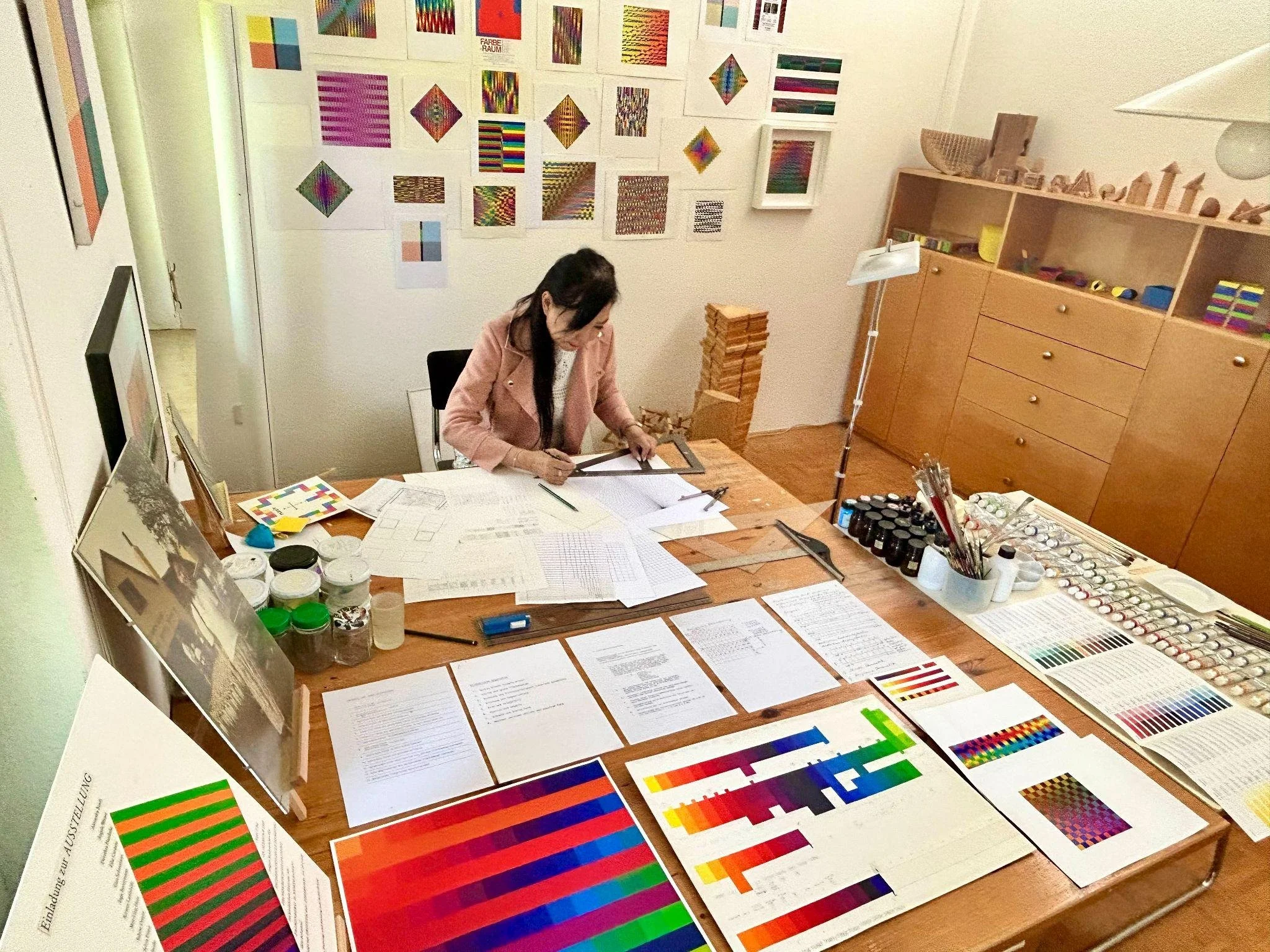
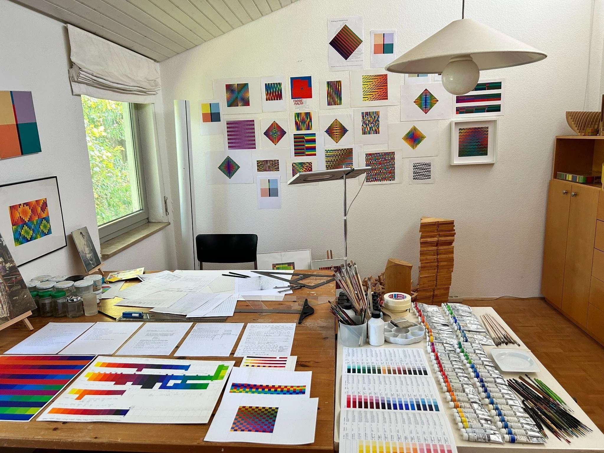
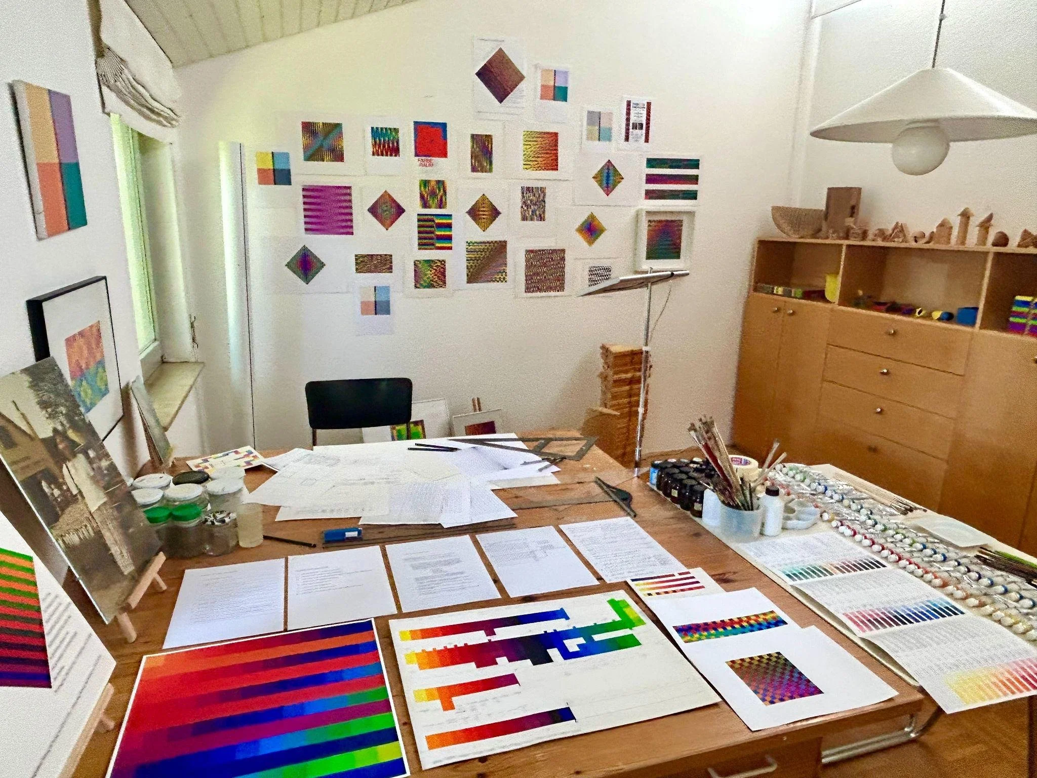
The studio is the environment in which the research develops.
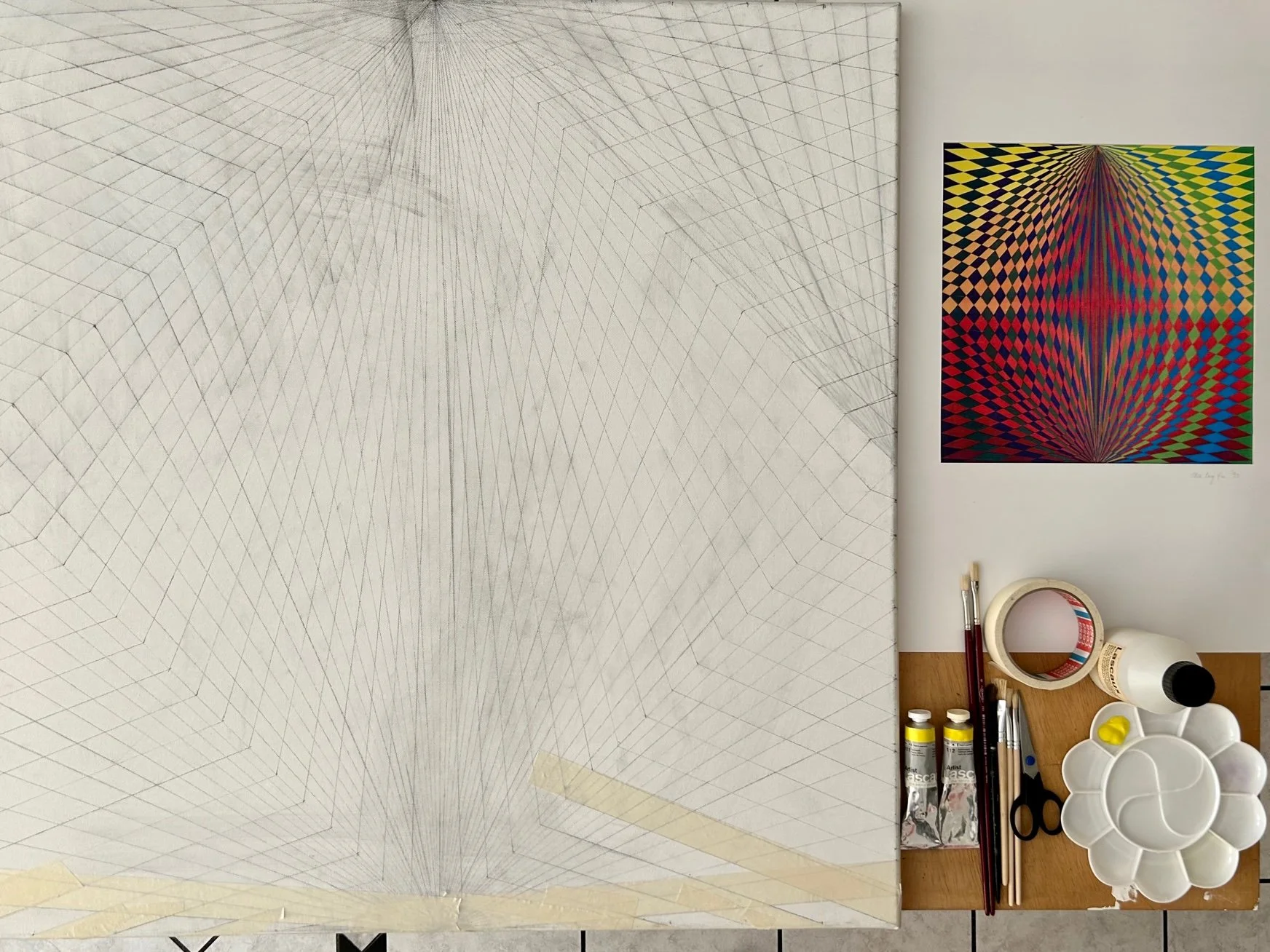
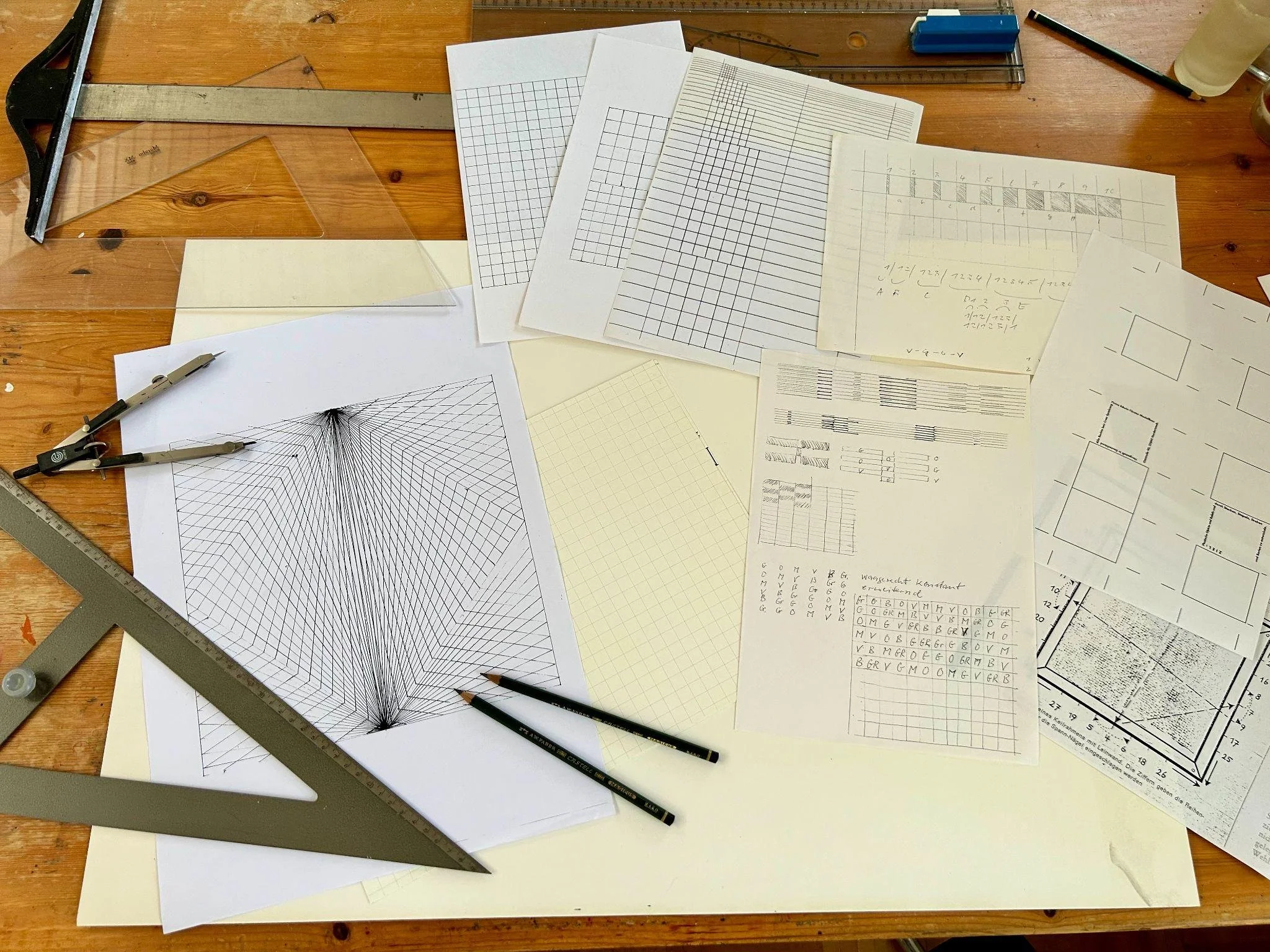
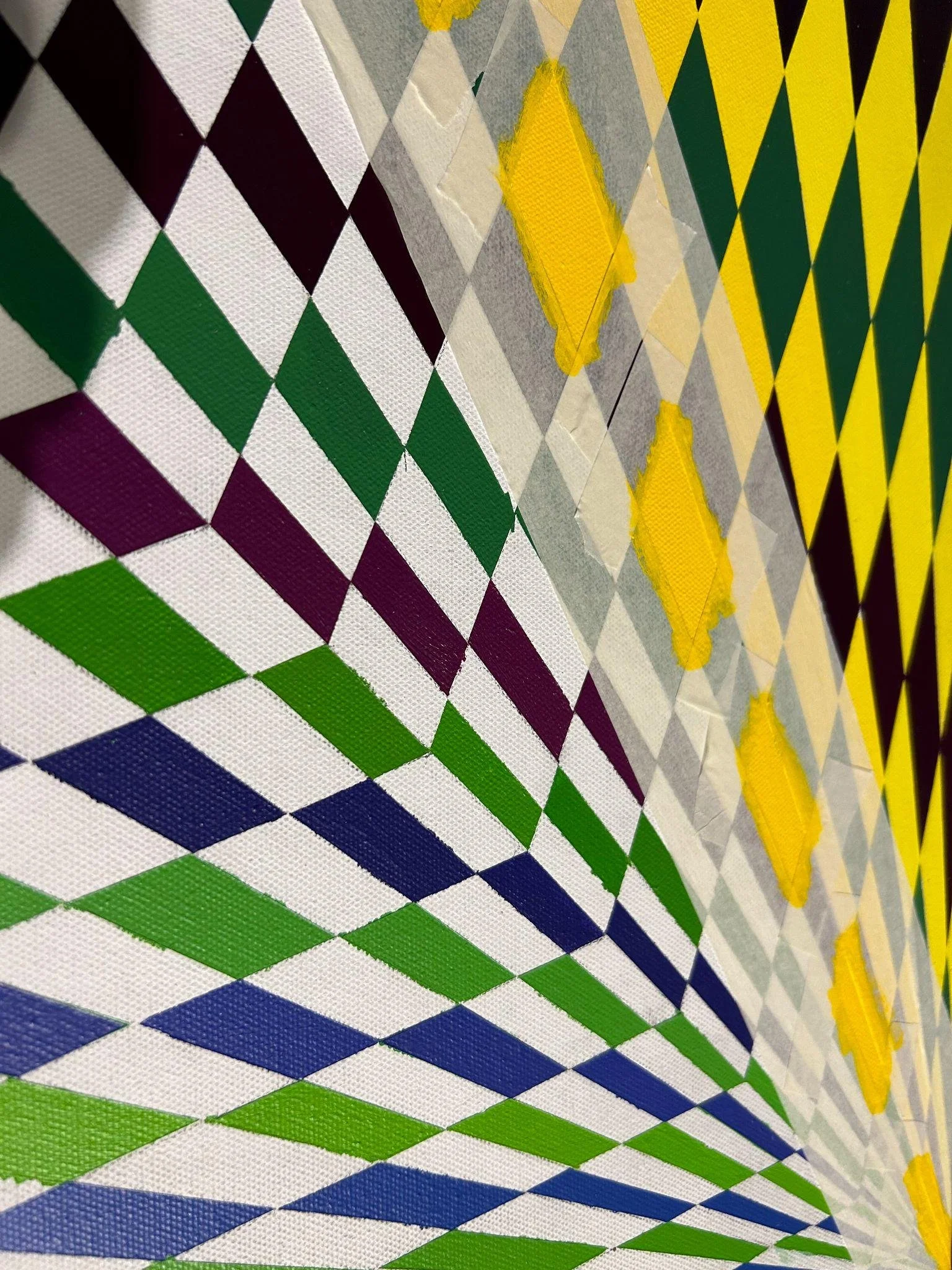
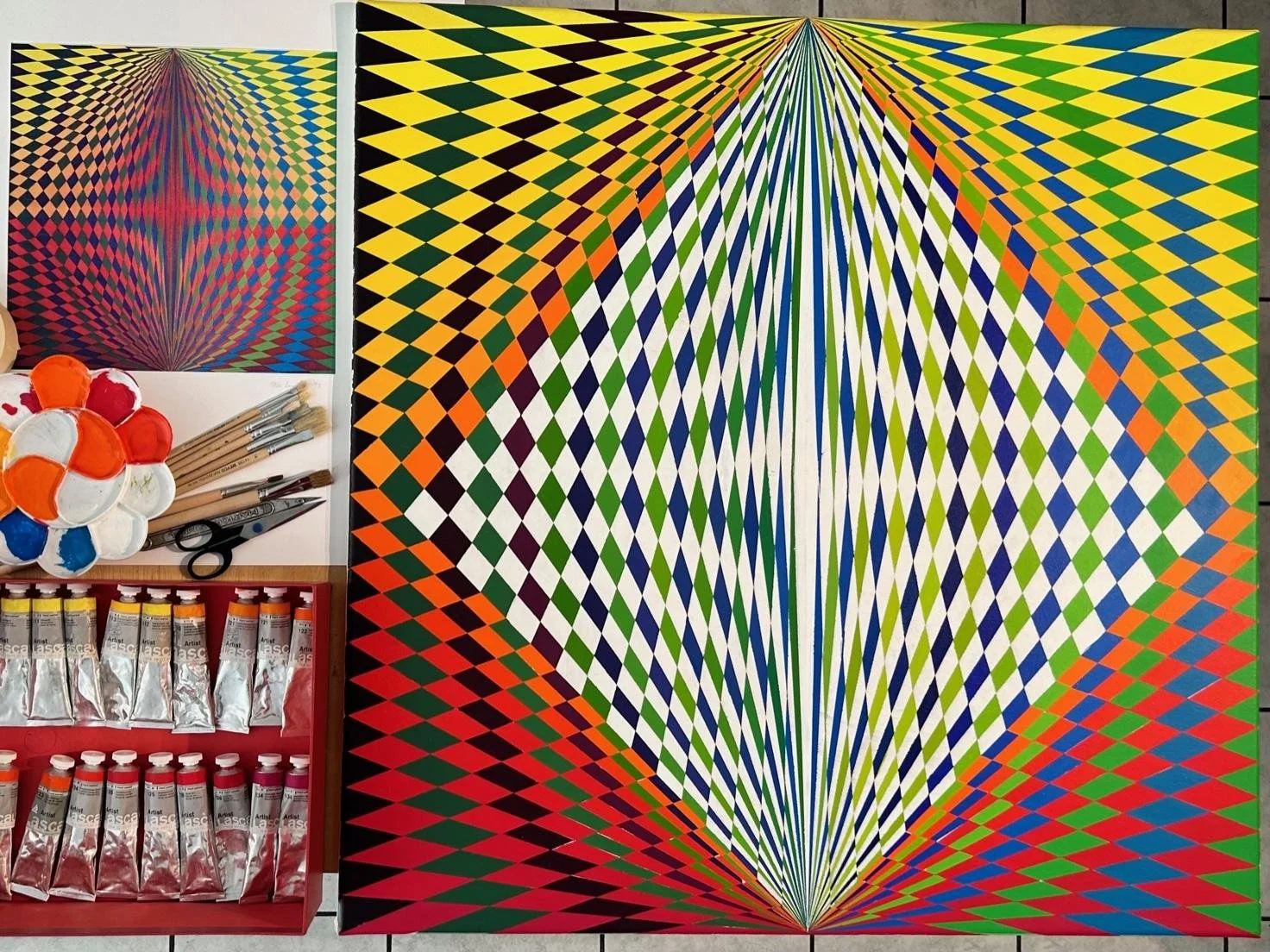
I use making as a way of observing, testing, and questioning. Colour, geometry, material, form, and space are explored through experimentation.
Unexpected results and shifts that emerge through making become evidence for further inquiry, allowing the work to evolve through observation, reflection, and discovery.
WHAT I WORK WITH
COLOUR
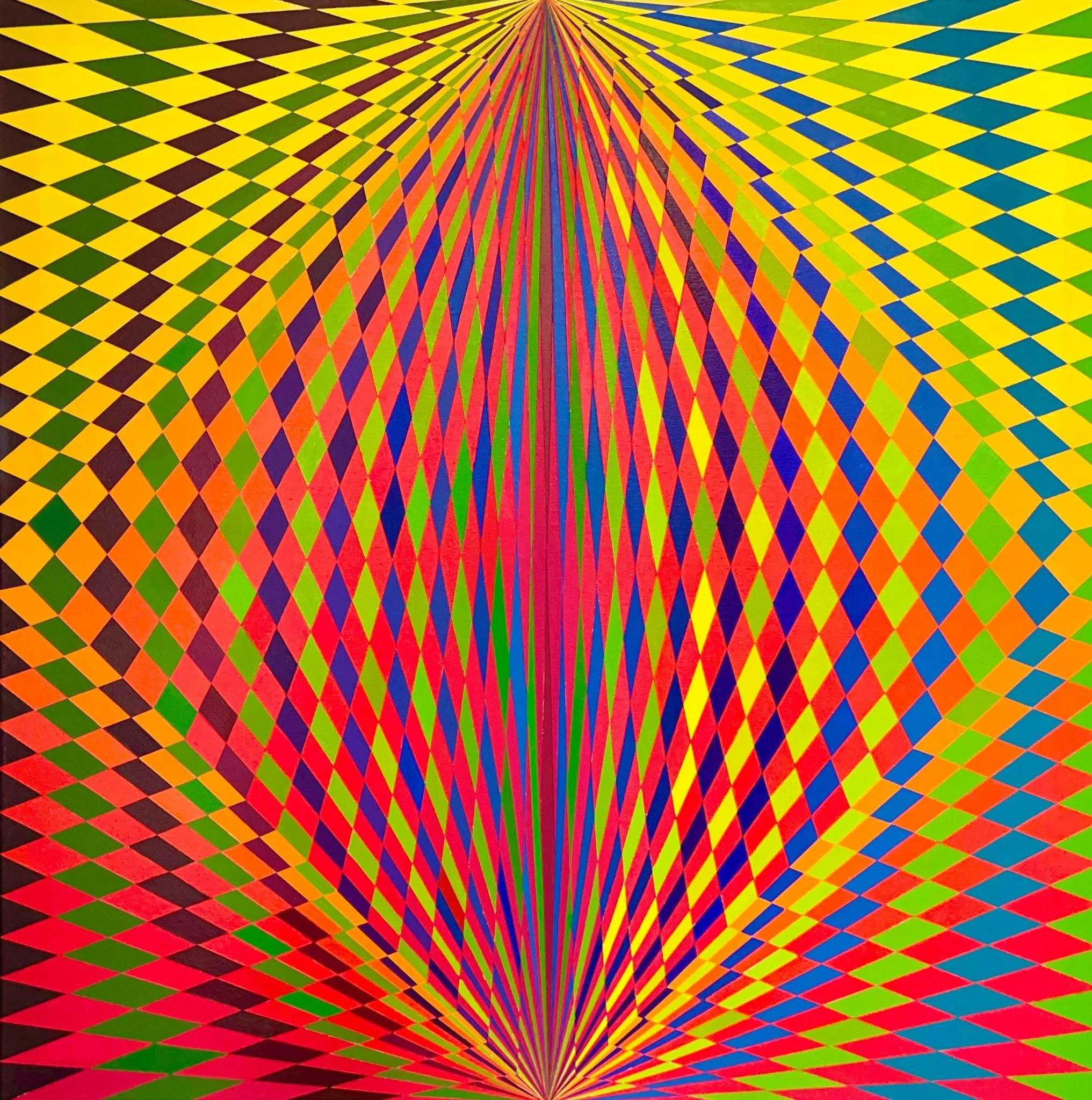
Colour relationships, contrast, intensity, perception, interaction, and spatial effect.
GEOMETRY
Line, shape, proportion, repetition, rhythm, structure, and organisation.
MATERIAL
Texture, resistance, construction, physical behaviour, transformation, and change.
FORM
Two-dimensional and three-dimensional relationships between shape, structure, volume, and composition.
SPACE
Scale, distance, arrangement, movement, spatial relationships, and encounter.
MEDIA
The research explores diverse media as vehicles for visual investigation:
● Painting
● Drawing
● Installation
● Photography
● Artist books
● Mixed media
● Digital documentation
● Sketchbooks and research archives
–––––––––––––––––––––––––––––
METHODS · MEDIA · FORMATS
METHODS
Artistic Methods
The research uses practice-based artistic methods in which making, observation, reflection, and critical analysis work together to generate and develop knowledge through artistic practice.
Practice-Based Artistic Research
Artistic practice serves as a primary mode of inquiry, with artworks and their development providing sites of investigation and evidence through which knowledge can emerge.
Reflective Practice
Reflection examines artistic decisions, experiences, and transformations throughout the making process, helping to identify what emerges through practice.
Studio Inquiry
The studio operates as a research environment where ideas, materials, and visual relationships are investigated through experimentation and making.
Material Experimentation
Materials are explored as active components of the research process, with interactions between colour, form, surface, and space generating new possibilities and unexpected outcomes.
Visual Analysis
Colour relationships, geometric structures, spatial compositions, and material qualities are analysed to understand how visual and perceptual relationships develop through artistic practice.
Iterative Making
Repeated cycles of experimentation, observation, reflection, and transformation allow new artistic directions, relationships, and understandings to emerge through practice.
Documentation and Archiving
Sketchbooks, photographs, process records, and research journals document the development of artistic thinking and provide evidence for critical reflection and methodological development.
Critical Reflection
Ongoing reflection connects artistic practice with research questions and supports the development of TCFM and new knowledge about how lived experience can be transformed through making.
FORMATS
The research is developed and communicated through:
● Studio practice
● Artistic projects
● Exhibitions
–––––––––––
EXHIBITION
––––––––––––––––––
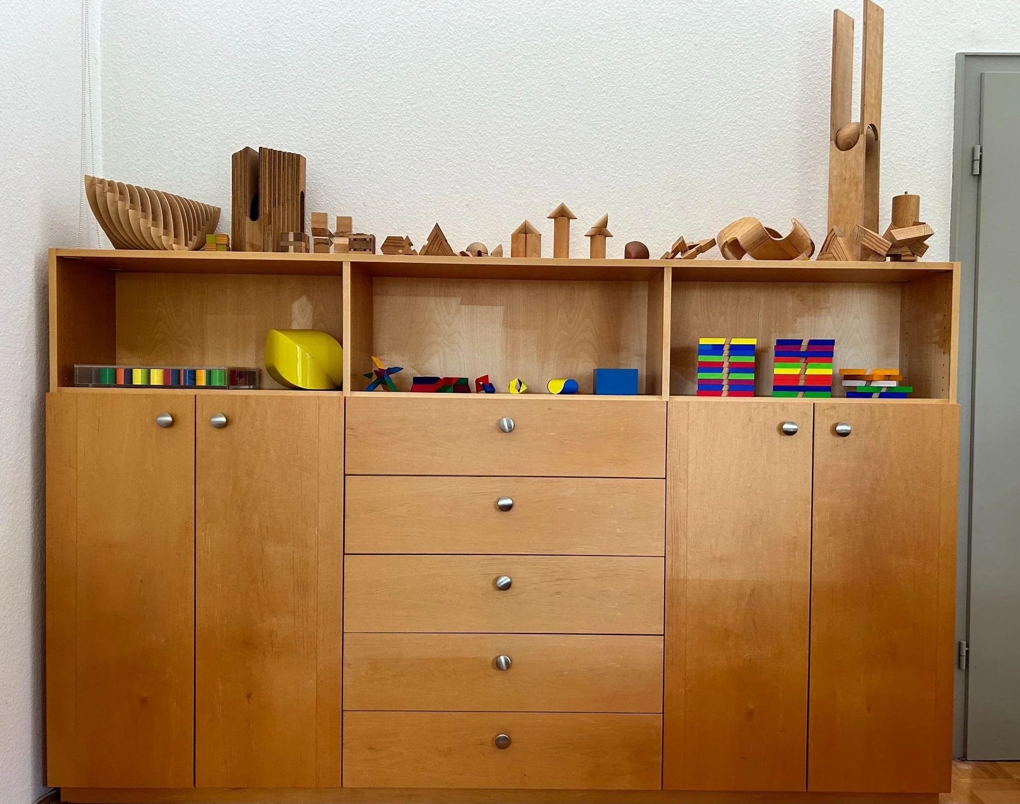
STUDIO PRACTICE
–––––––––––––––––––
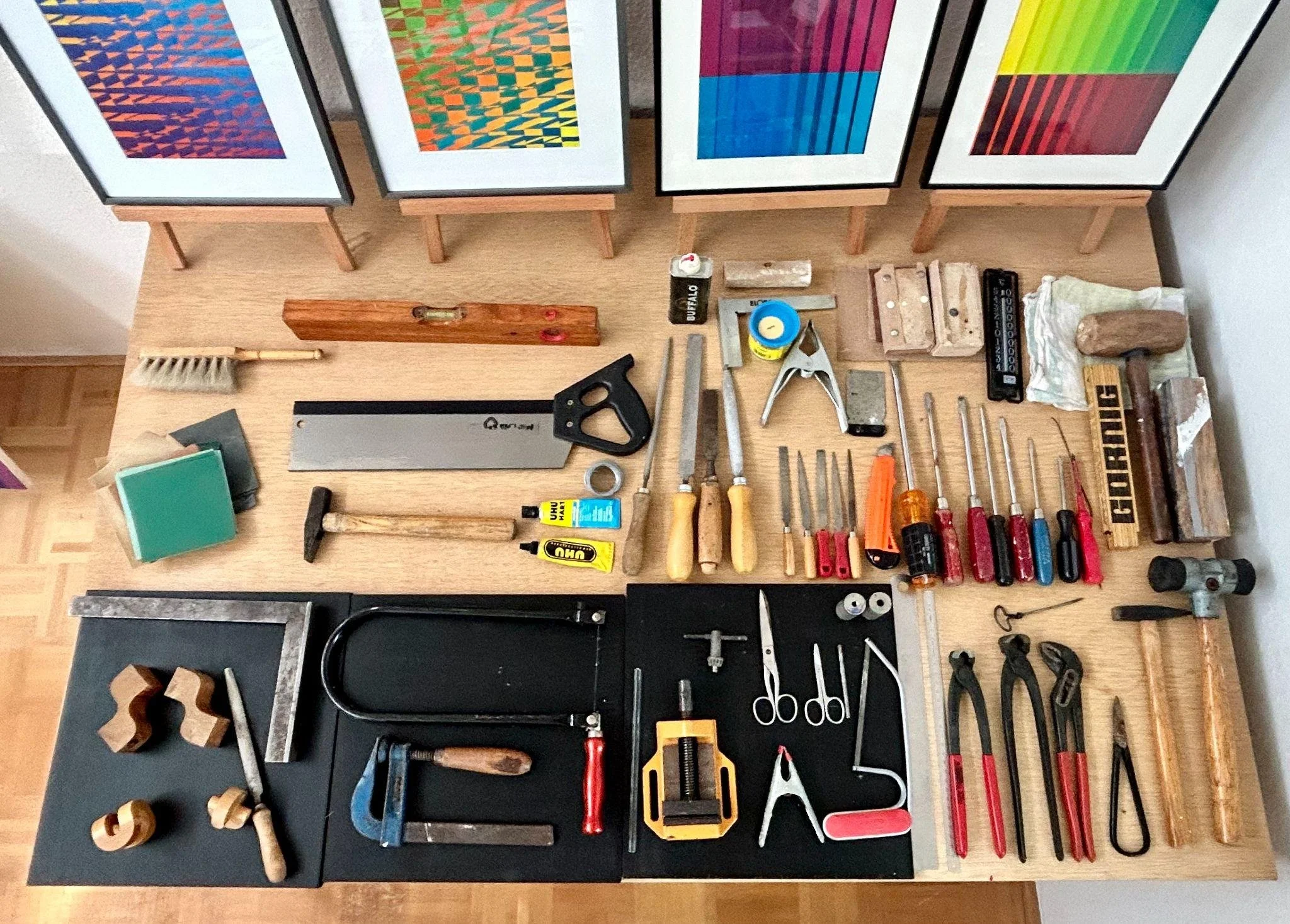
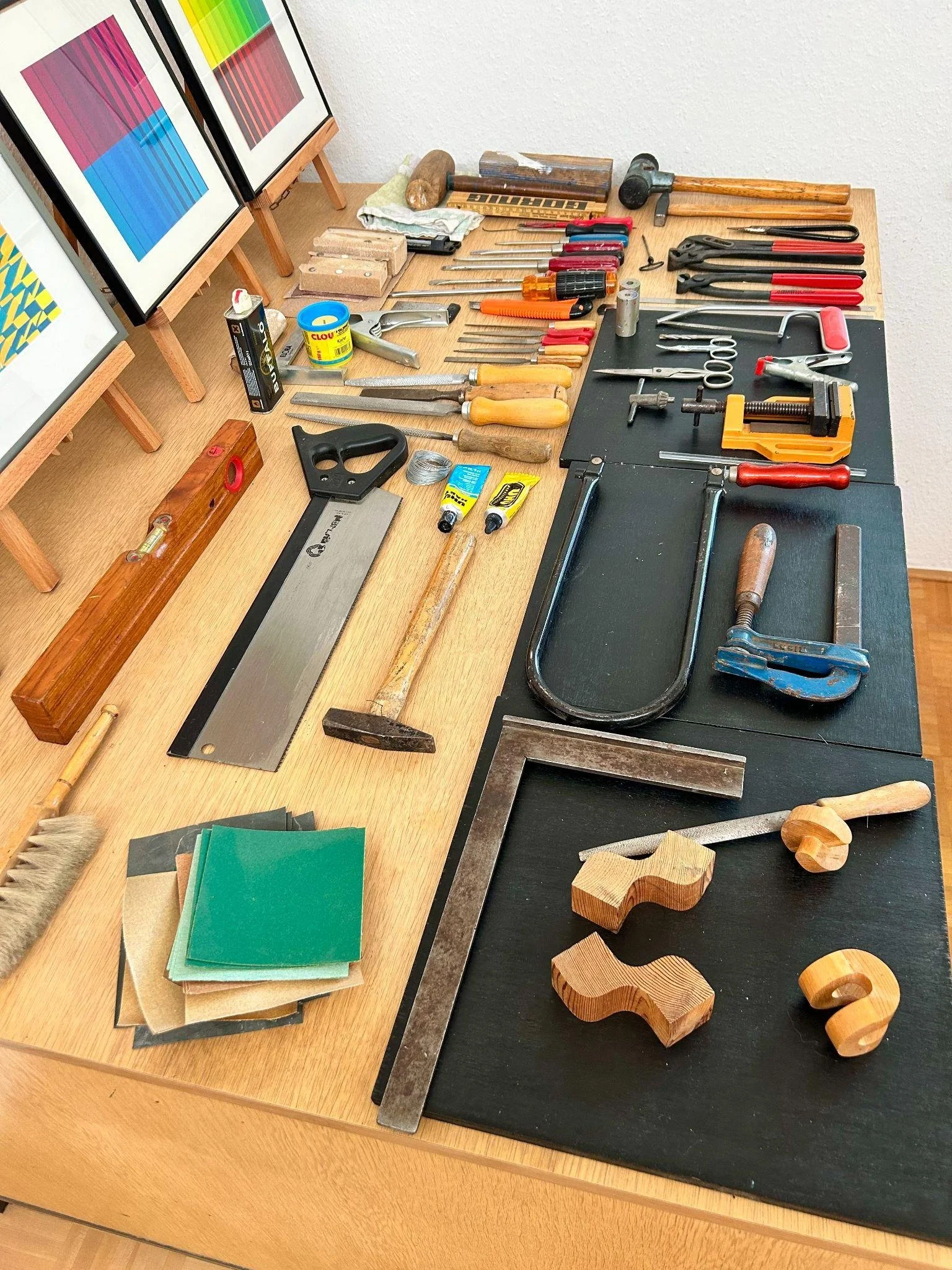
ARTISTIC PROJECTS
–––––––––––––––––––––––––
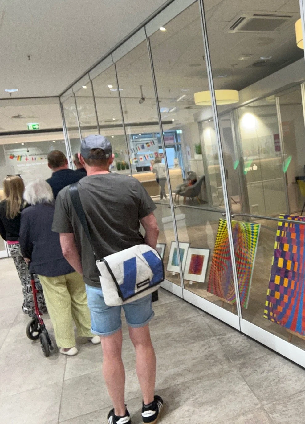
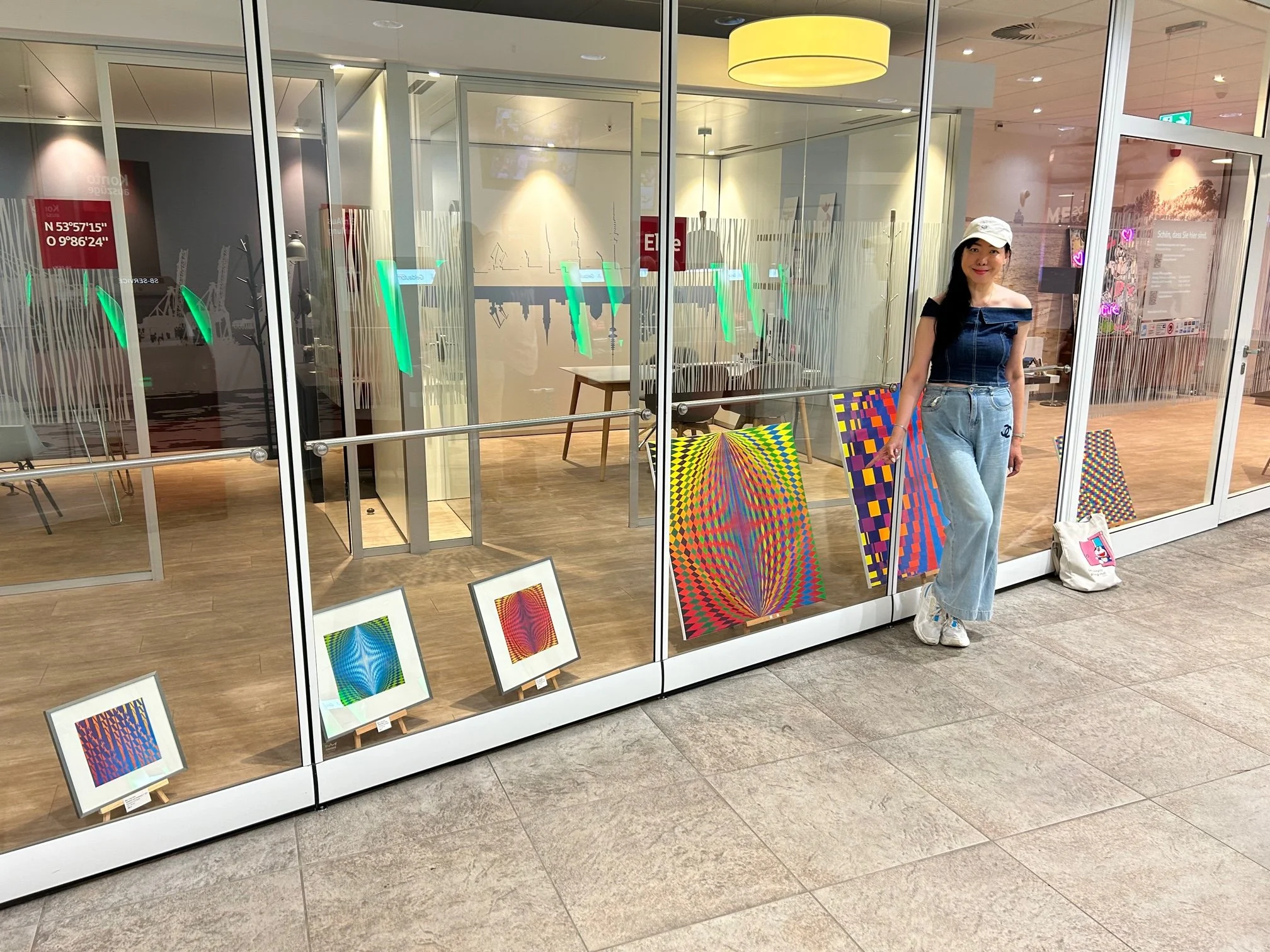
EXHIBITION INSTALLATION
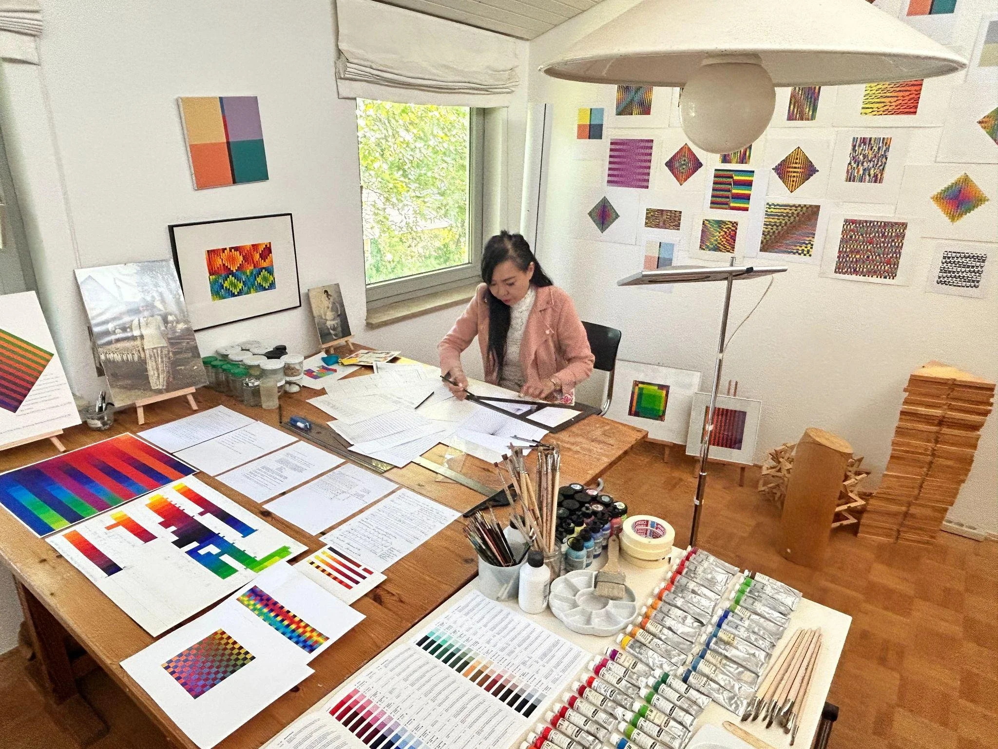
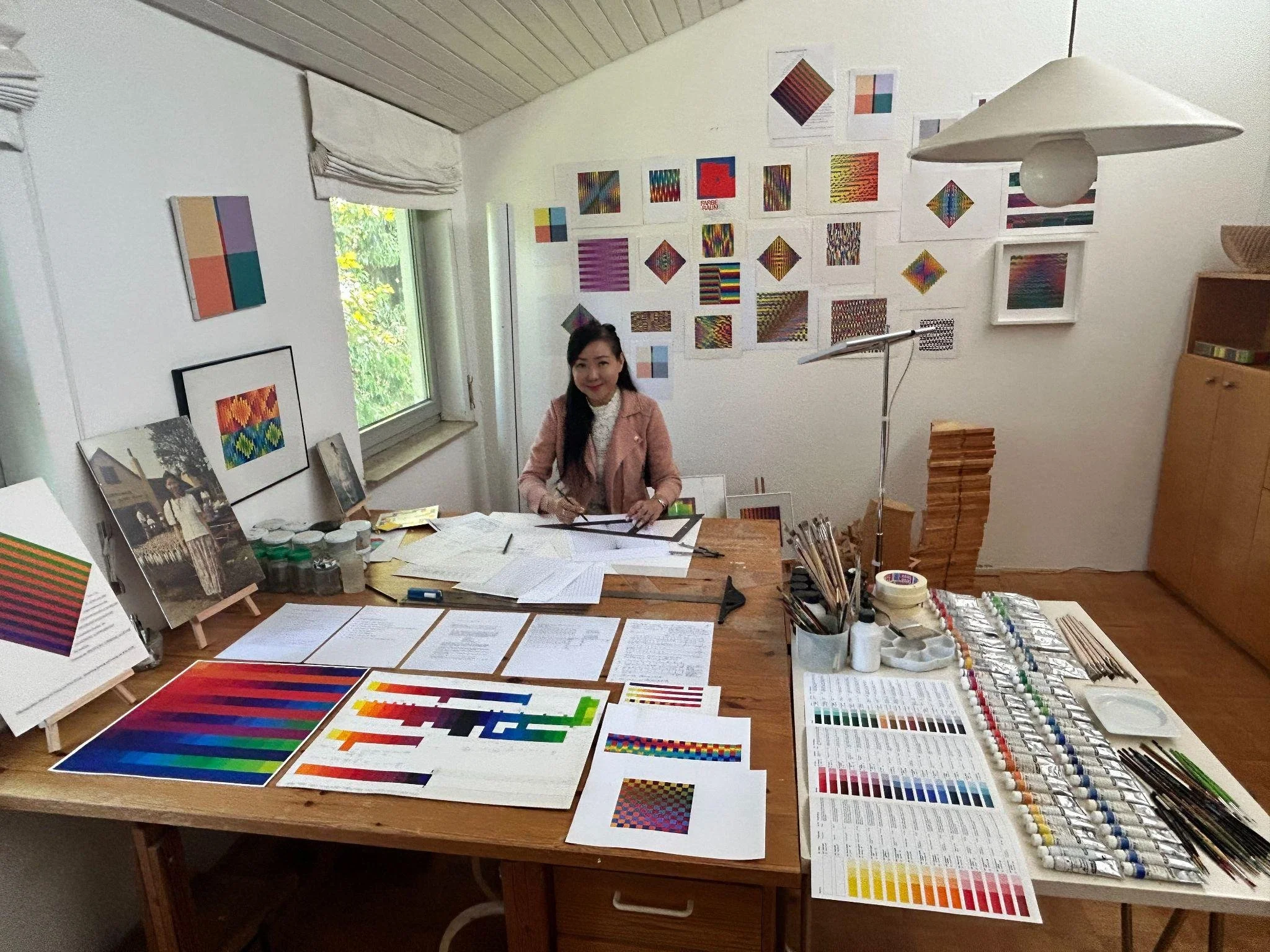
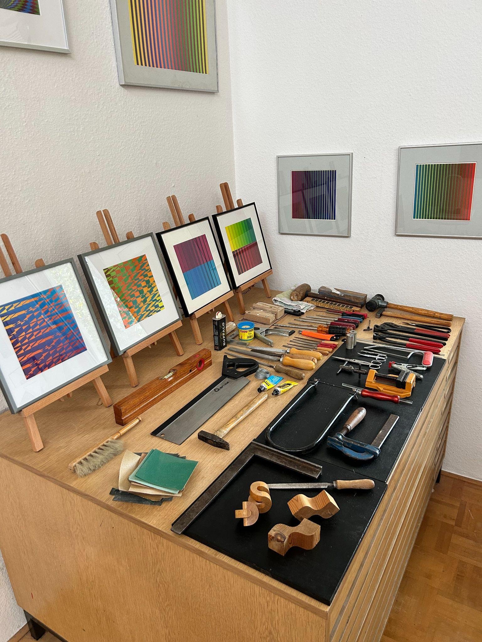
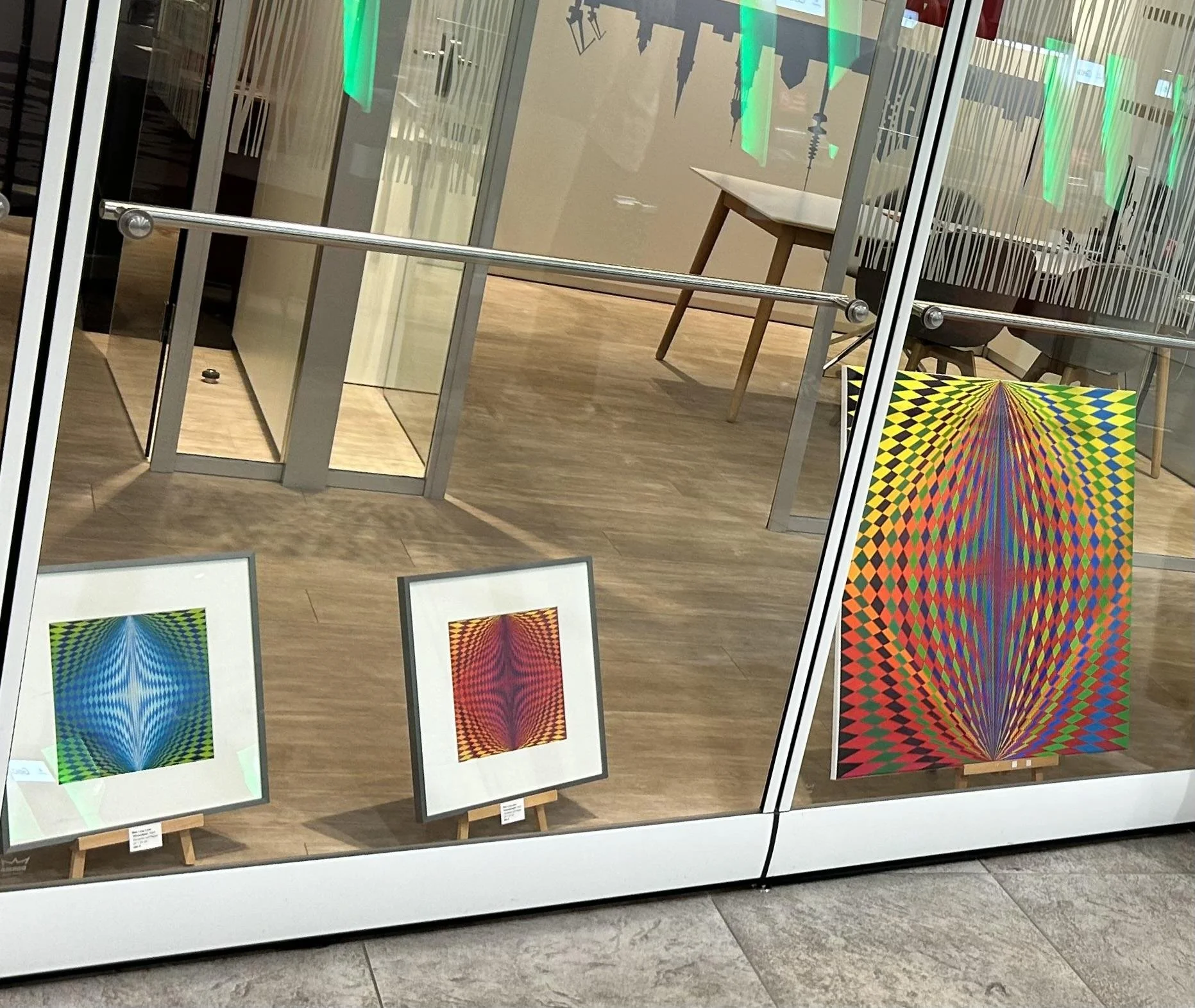
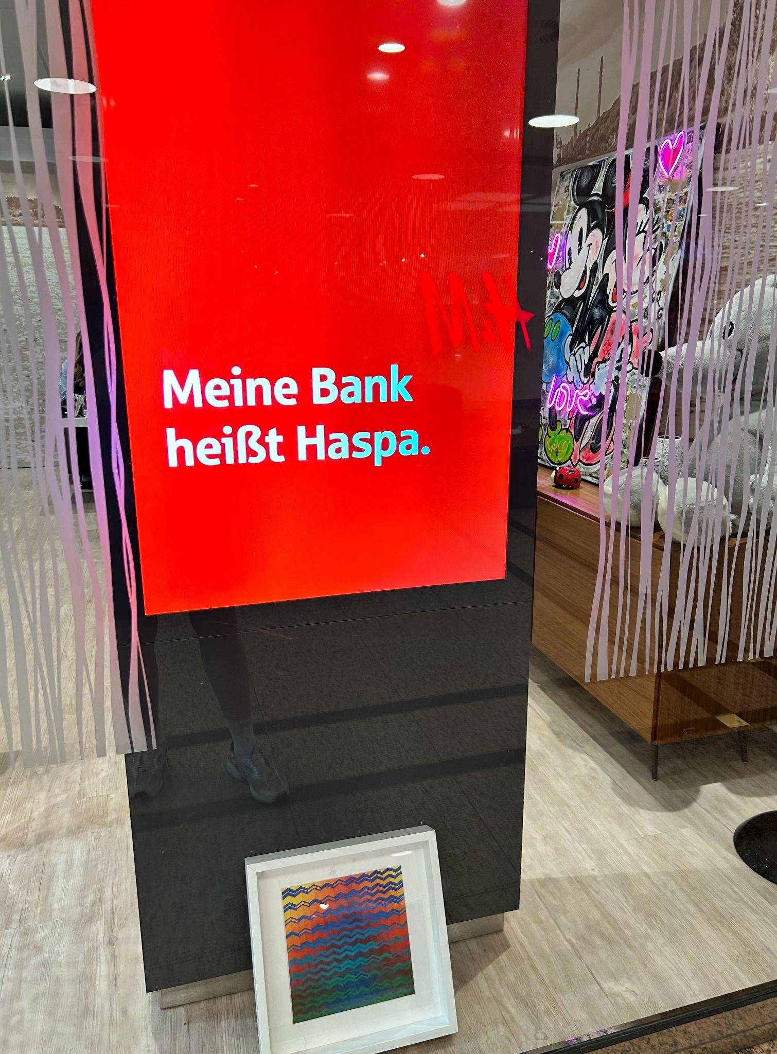
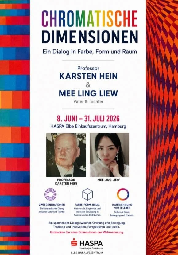
Exhibitions provide a context for presenting, testing, and reflecting on artistic and visual knowledge through public engagement.
● Workshops
● Teaching activities
● Cross-cultural artistic exchange
● Research documentation
● Dissertation
MAKING AS RESEARCH
My artistic process begins with an experience, observation, memory, question, or visual idea, explored through colour, geometry, material, form, and space.
Through making, intentions shift as materials, colours, structures, and spatial relationships generate unexpected experiences and discoveries. I document and reflect on what emerges, using these observations to guide further experimentation and inquiry.
Making is both the production of an artwork and a mode of artistic research through which knowledge can emerge through practice.
––––––––––––
EXPERIMENT
Testing · Repetition · Variation · Reconstruction
–––––––––––––––––––––––––––––––
CHANGE / UNEXPECTED RESULT
Encounter · Discovery · Redirection
––––––––––––––––
STARTING POINT
Experience · Observation · Memory · Question
––––––––––––––––
FIRST RESPONSE
Sketch · Colour study · Material response
––––––––––––––––––––
WORK IN PROGRESS
Emerging relationships · Decisions · Changes
–––––––––––––––––––
DEVELOPED WORK
Transformation
Reflection
Further question
ONE MAJOR ARTWORK — DEVELOPMENT STRUCTURE
PORTFOLIO
SELECTED ARTISTIC WORKS
A focused selection of works tracing the development of my artistic practice and its relationship to my proposed doctoral research.
The works explore lived experience, colour, geometry, spatial form, material experimentation, and reflection, while process documentation reveals how experimentation and unexpected outcomes shape the work.
Together, they provide the artistic foundation for the further development and critical examination of the Transformative Colour–Form Methodology (TCFM).
–––––––
ORIGIN
Youth in Action, Winterveldt, South Africa
The lived encounter from which the work emerged.
–––––––––––––––
DEVELOPMENT
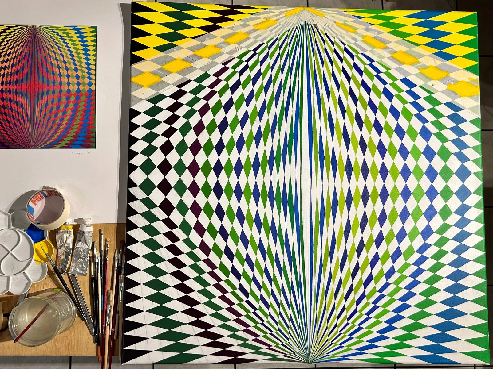
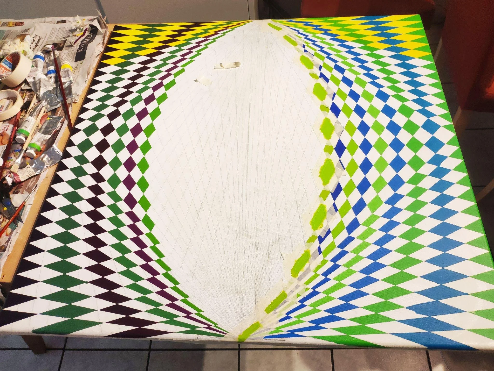
Early colour study → developing colour relationships → structural development → completed work. Development through experimentation with colour, proportion, geometric structure and material layering.
CORE ARTWORK 01
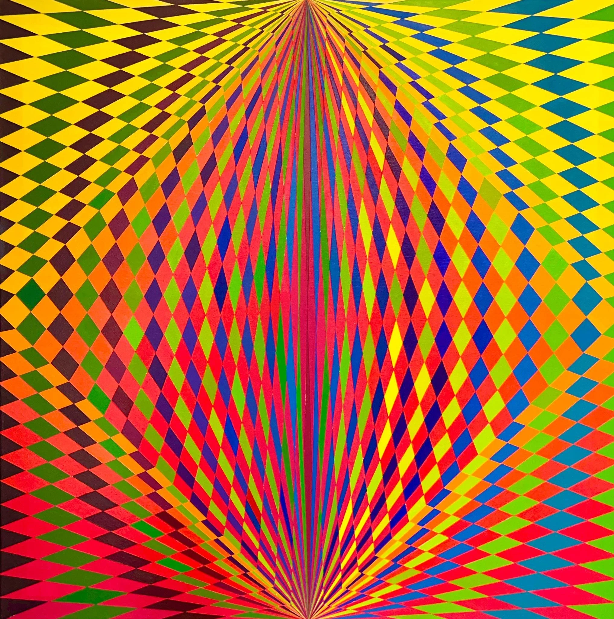
Unconditional Love
2026 | Acrylic | 80 × 80 cm
Unconditional Love explores how emotional experience can be translated into formal relationships through colour, geometry, proportion, layering, and spatial organisation, allowing meaning to emerge through the process of making.
Unconditional Love emerged from my involvement with Youth in Action, Winterveldt, a community initiative supporting disadvantaged young people through practical assistance, skills development and opportunities for greater self-reliance. As the founder of Save African Children, I have been involved in community-based initiatives concerned with poverty, education, care and human dignity since 2011.
The experience of giving without expectation of return became central to the work: an understanding of care as an act of generosity, compassion and human connection. This sustained experience led me to reflect on how love, resilience and hope might be transformed into visual form.
Rather than representing these experiences literally, I explored how they could be reconfigured through colour, geometry, rhythm and space.
ARTISTIC INVESTIGATION
The work investigates the relationship between colour, geometric organisation, rhythm, balance and spatial expansion.
The composition develops through a structured sequence of colour relationships, with proportional relationships extending inward and outward from a central cross-like structure. Variations within the colour field create shifts in intensity and spatial perception, while repetition and symmetry establish a sense of balance and continuity.
Rather than illustrating the idea of unconditional love, I explored how an experience of giving, care and human connection might become an autonomous visual language through the relationships between colour, form and space.
The work asks:
How can an experience of unconditional giving be transformed into an abstract visual language through colour, geometry, rhythm and space?
PROCESS
The work developed through successive experiments with colour relationships, geometric structures, proportional organisation, layering and material application.
I explored variations within the colour field while maintaining a consistent underlying sequence and compositional structure. Changes in colour, proportion and spatial relationships produced unexpected shifts in visual balance and perception, influencing subsequent decisions.
Making therefore became a process of investigation in which colour, form and composition were tested through practice rather than simply applied to a predetermined image.
The development photographs make this progression visible through successive stages of colour and compositional development.
RESEARCH RELEVANCE
Unconditional Love marks an early point of departure for my continuing investigation into how lived and emotional experience can become a source of visual investigation without being represented literally.
The work demonstrates an emerging interest in how colour, geometry, material, form and space can transform experience into an autonomous visual language.
The social encounter provided the starting point, while the research unfolded through its artistic transformation. The painting therefore contributes to my continuing investigation of how experience can generate formal relationships, and how formal relationships can in turn produce new ways of understanding experience.
REFLECTION
The process raised a continuing question within my practice:
What changes when an experience moves from memory and reflection into material and visual form?
The work suggests that meaning is not transferred directly from experience into an image. Instead, it is reconstructed through artistic decisions, material encounters and relationships that emerge during making.
The idea of unconditional love therefore moved beyond its original social context and became a formal investigation of giving and receiving, centre and expansion, repetition and variation, balance and movement.
Through this transformation, lived experience became colour, reflection became structure, and an ethical idea became a visual relationship.
–––––––
ORIGIN
Bukola Primary School, Mityana District, Uganda
A moment from the experience that initiated the work.
CORE ARTWORK 02
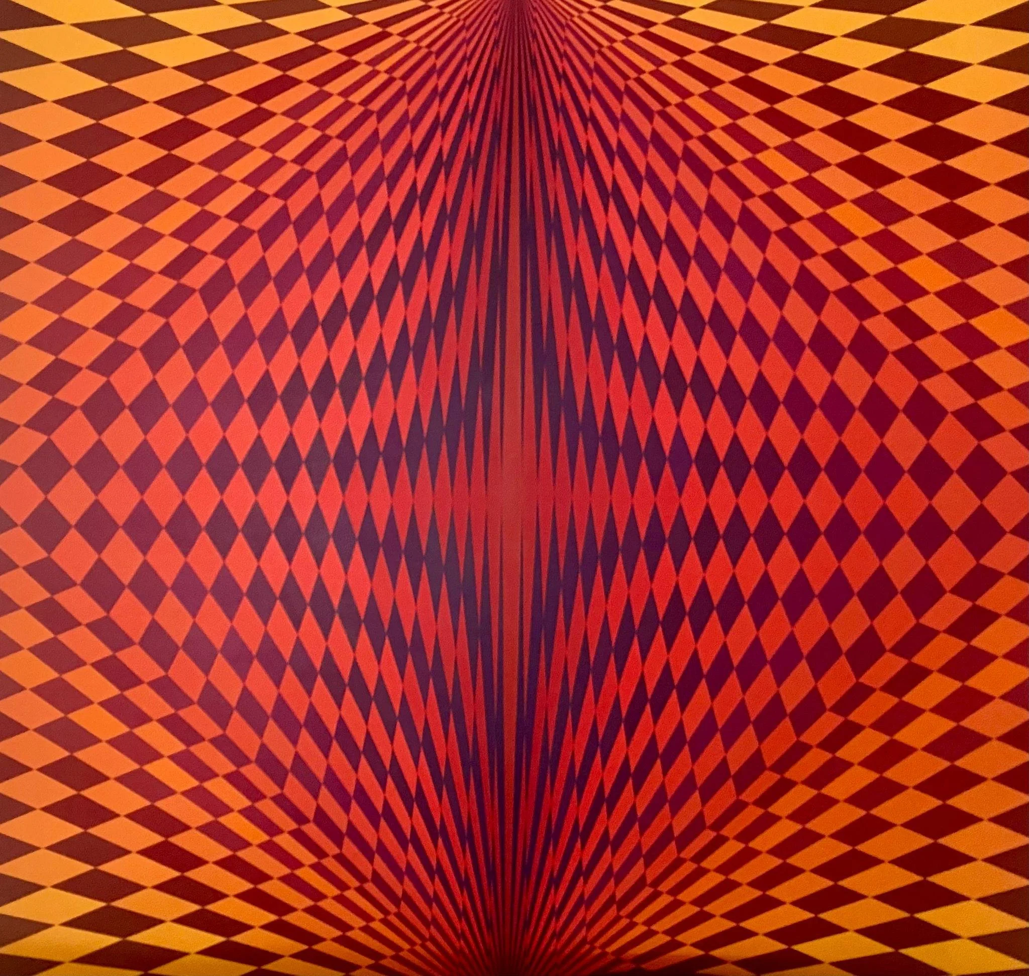
A Field of Warmth
2024 | Acrylic | 150 × 150 cm
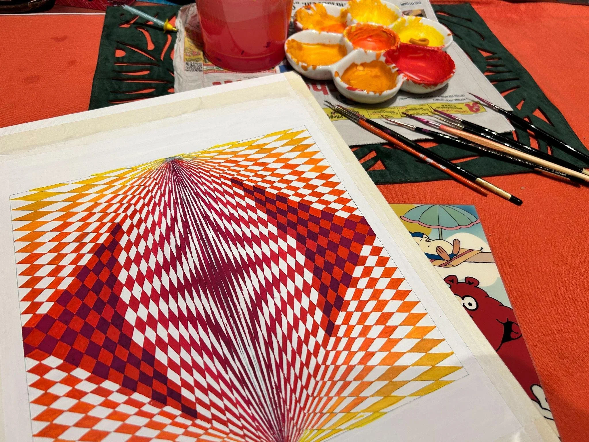
A Field of Warmth explores the relationship between warm colour fields and geometric structure through layering, repetition, and spatial balance.
This work emerged from my experience of visiting Bukola Primary School, Mityana District, Uganda, to teach art. Hundreds of children gathered around me on the school field, many wearing vivid red and orange uniforms.
Their collective presence remained with me as a memory of colour, movement, warmth and connection. Rather than documenting the encounter literally, I carried this experience into the studio and explored how it might be transformed through colour, repetition, geometry and space.
ARTISTIC INVESTIGATION
Rather than depicting the children literally, I explored the encounter through warm colour, repetition, geometric form and spatial convergence.
The reds, oranges and violets became visual forces, while repeated forms create a sense of gathering, movement and connection towards the centre.
The work asks:
How can lived experience be transformed into an abstract visual experience through colour, repetition and space?
PROCESS
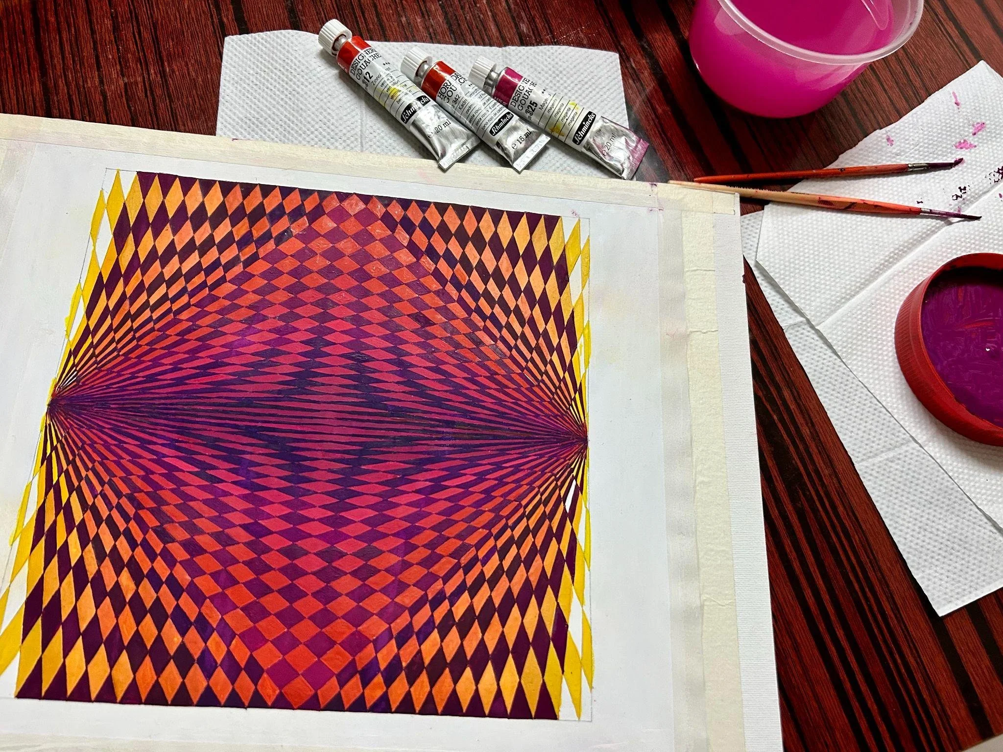
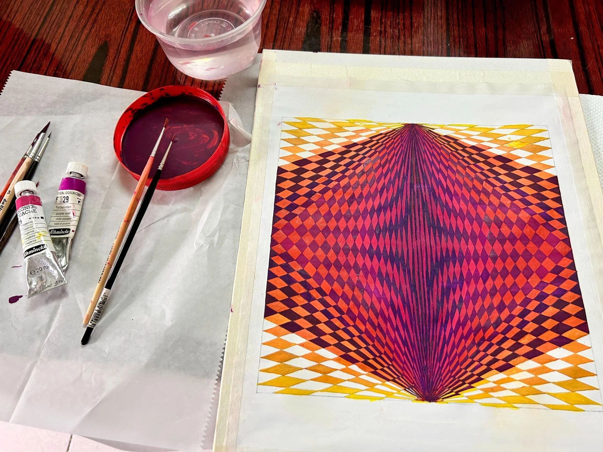
The painting developed through experimentation with colour intensity, repeated forms, geometric structures and spatial relationships.
As forms were repeated, repositioned and brought into relation with one another, the composition began to generate a sense of collective movement and convergence that was not fully predetermined at the beginning.
Making became a process of testing relationships between colour, rhythm, repetition and space, allowing the visual structure to develop through both intention and discovery.
RESEARCH RELEVANCE
A Field of Warmth contributes to my investigation of how memory can become a starting point for artistic enquiry rather than something to be represented directly.
The lived encounter provided the starting condition, while the process of making transformed it through colour, repetition, rhythm and spatial relationships into an autonomous visual language.
The work also reflects my understanding that human connection can be experienced through attention, presence, generosity and shared space.
REFLECTION
The children became the starting point, but the finished work moves beyond the original encounter.
Through abstraction, memory becomes colour, presence becomes rhythm, and gathering becomes space.
The movement from lived experience → memory → abstraction has become an important part of my developing artistic research practice, in which experience is not reproduced but reconfigured through visual and material decisions.
–––––––––––––––
DEVELOPMENT
Where authentic development documentation is available, it can be included to show meaningful changes in colour relationships, repetition, geometric structure and spatial convergence.
–––––––
ORIGIN
Thulaganyo Secondary School, Winterveldt, South Africa
The lived encounter that initiated the investigation.
A 2014 encounter with students exploring education, persistence and future possibilities became the starting point for this work.
Rather than representing the encounter literally, I carried its questions into an abstract investigation of colour, repetition, rhythm and spatial interval.
ARTISTIC INVESTIGATION
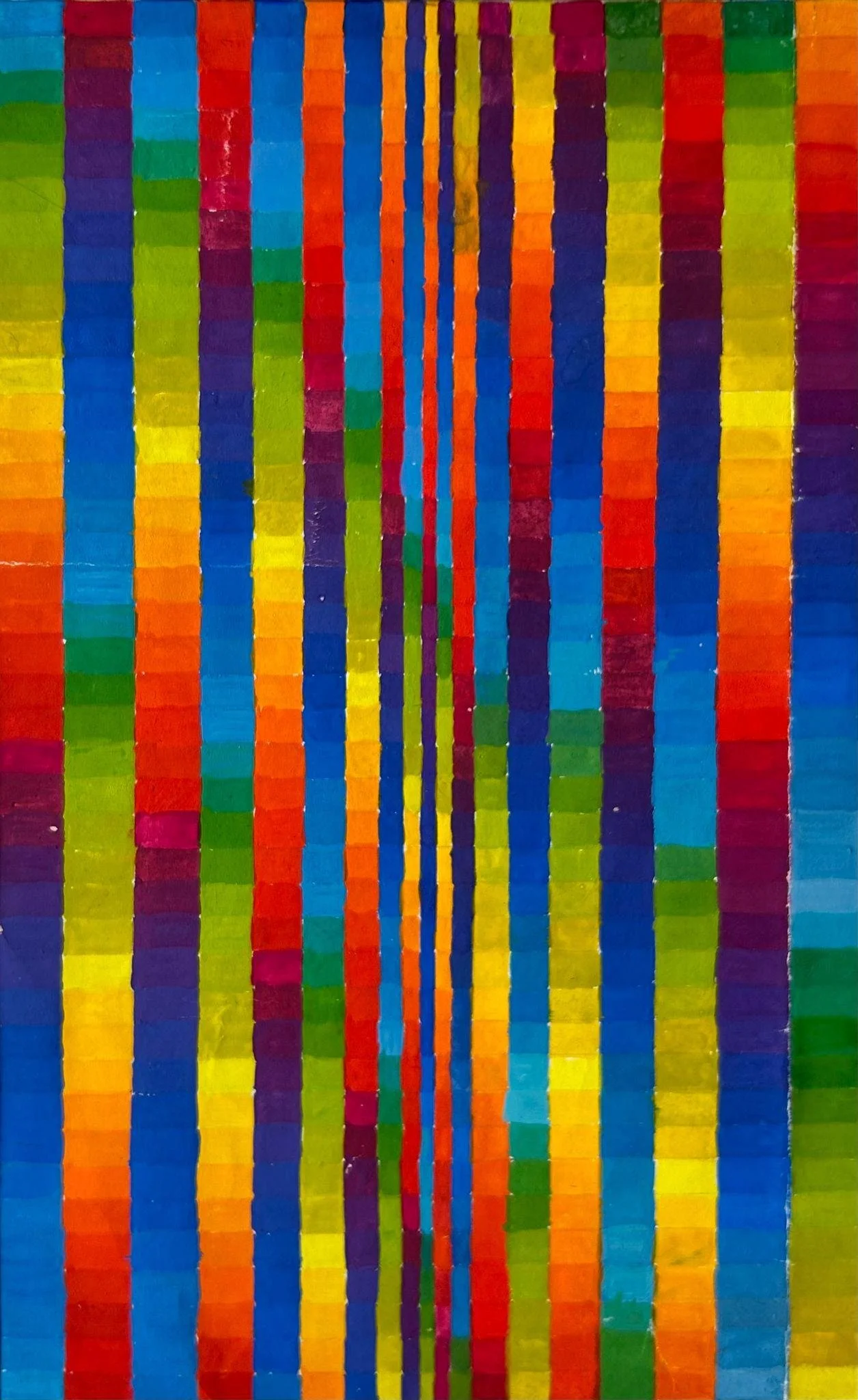
The composition is structured through 19 straight lines and 42 colours, developed from a spectrum derived from the principal colours of the rainbow.
Repeated colour sequences and changing intervals create a tension between continuity and variation, generating rhythm, movement and shifting spatial perception.
How can lived experience become an abstract visual language through colour, repetition and space?
RESEARCH
The work investigates how lived experience can initiate visual enquiry without determining the final image.
The encounter provided the conceptual starting point; experimentation with colour, line, repetition and scale became the site through which the enquiry developed.
Lived experience initiates the enquiry; making generates knowledge.
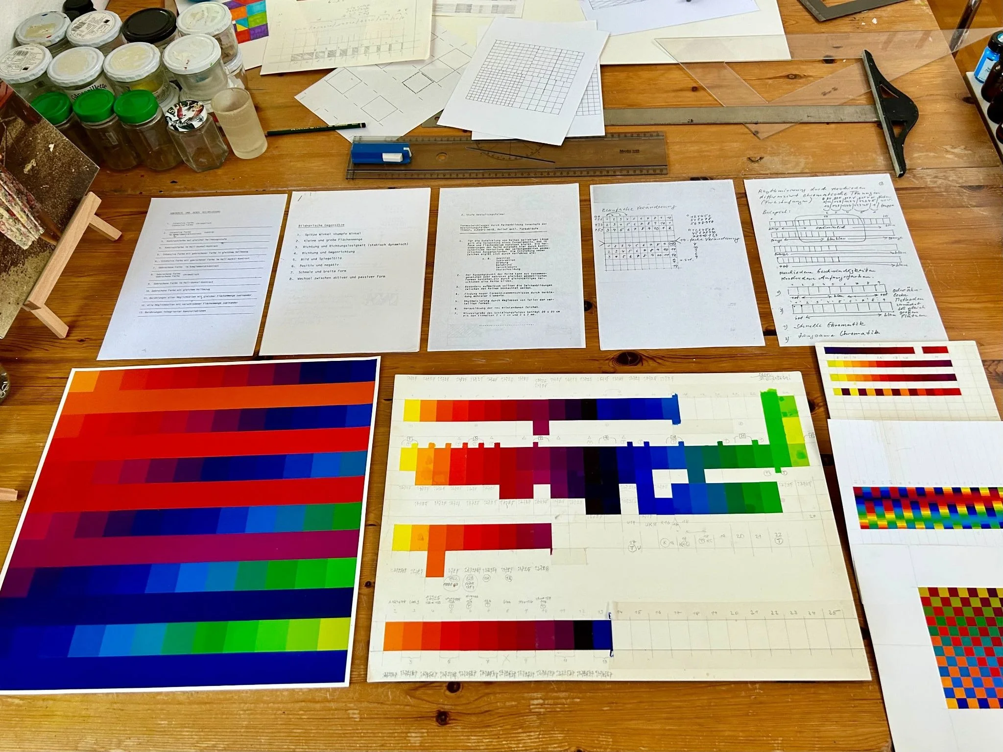
DEVELOPMENT
[PHOTO 1]
Early colour and structural study.
[PHOTO 2]
Development of repetition and spatial interval.
EXTENDED RESEARCH
From lived experience to abstraction through colour, repetition and spatial structure.
CORE ARTWORK 03
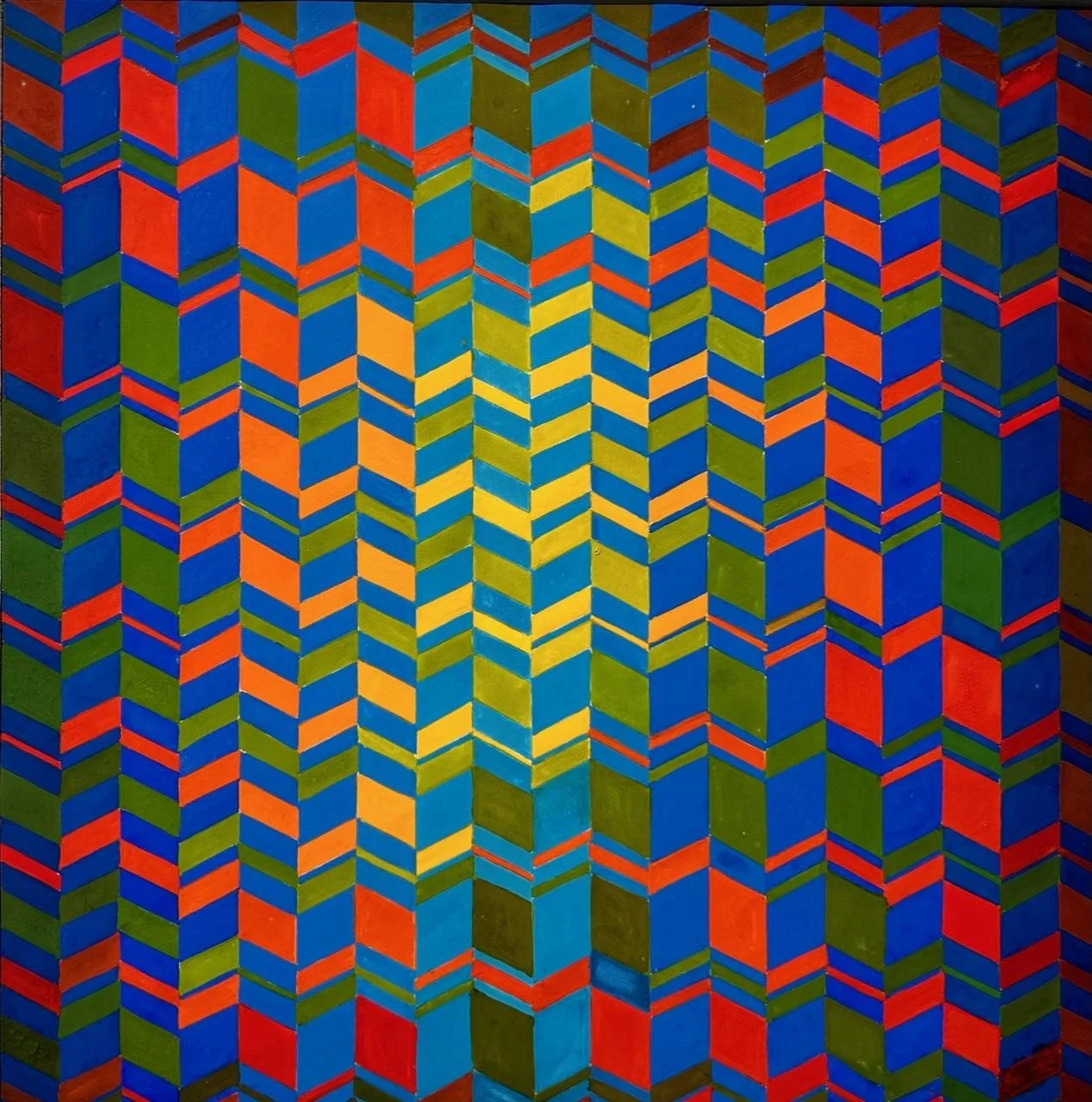
Luminous Spectrum
2022 | Acrylic | 90 × 110 cm
Luminous Spectrum explores how a lived encounter can initiate an abstract visual investigation in which colour, line, repetition, rhythm, and spatial intervals shape visual perception.
–––––––
ORIGIN
I.R. Lesolang High School, Winterveldt, Pretoria, South Africa.
The lived experience that initiated the work.
–––––––––––––––
DEVELOPMENT
CORE ARTWORK 04
Emergence
2020 | Acrylic | 24 × 24 cm
Emergence explores how a lived encounter can be transformed into visual knowledge through colour, geometric form, spatial relationships, and movement.
This work emerged from my visit to I.R. Lesolang High School, Winterveldt, Pretoria, South Africa, where I spoke with students about education, aspiration, resilience, self-respect and the possibility of a different future.
ARTISTIC INVESTIGATION
Rather than representing the experience literally, I transformed it through colour, geometry, three-dimensional form and space.
Wave-like structures and geometric forms in red, blue, yellow, green and orange, together with contrasting light and dark surfaces, create relationships of movement, resistance and possibility.
How can lived experience become visual knowledge through colour, form, geometry and space?
RESEARCH
The painting explores how a lived encounter can become a source of visual knowledge through the process of making.
The experience provided the starting point, but experimentation transformed it into colour, volume, spatial relationships and movement. Unexpected relationships emerging during the process influenced subsequent artistic decisions.
Memory became colour; experience became form; reflection became spatial structure.
–––––––
ORIGIN
Golden Youth Club, Winterveldt, South Africa /
KinderKulturKarawane, Germany
CORE ARTWORK 05
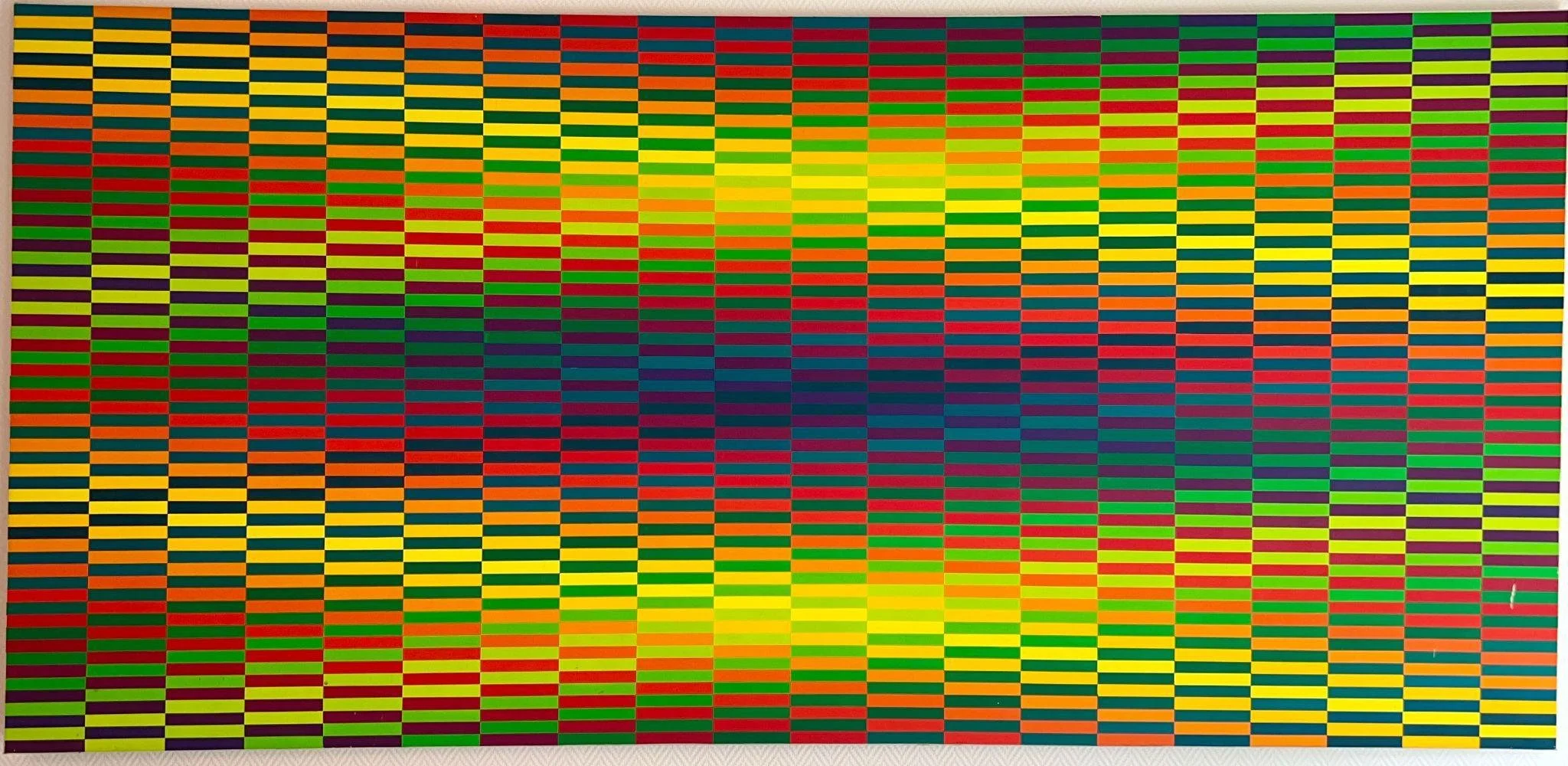
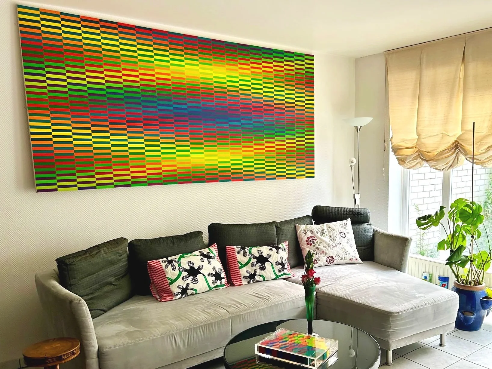
Radiant Presence
2014 | Acrylic | 120 × 250 cm
Radiant Presence explores how lived experiences of human connection, gratitude, and presence can be transformed into an abstract visual language through colour, repetition, rhythm, and spatial relationships. The work emerged from a longer engagement with youth, cultural exchange, and the value of presence.
Since 2011, Save African Children, a non-profit organisation dedicated to supporting children and young people, has worked in collaboration with Golden Youth Club in Winterveldt, providing opportunities through arts, culture, skills development and community projects.
ARTISTIC INVESTIGATION
The painting is structured through repeated rectangular units arranged across an extended horizontal field. Contrasting passages of yellow, green, orange, red, magenta and violet create shifts between luminosity, density, rhythm and visual intensity.
Rather than depicting happiness literally, the work explores how colour, repetition and spatial rhythm can evoke the experience of warmth, attention and presence.
How can the experience of being fully present become an abstract investigation of colour, rhythm and visual perception?
RESEARCH
The work considers happiness not as a permanent achievement, but as an awareness of ordinary moments, relationships, gratitude and presence.
The lived experience provided the starting point; painting became a means of examining how these reflections could be transformed into colour, structure and perceptual experience.
Experience initiates the inquiry; making transforms experience into visual knowledge.
–––––––––––––––
DEVELOPMENT
––––––––––––––––––––––
SELECTED PAINTINGS
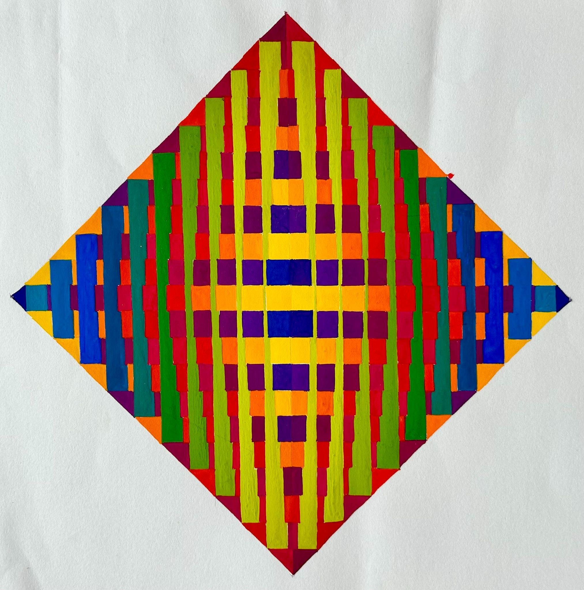
Chromatic Convergence I
2019 | Gouache | 21 × 21 cm
Chromatic Convergence I investigates the interaction of geometric form and colour through repetition, overlap, and shifting spatial relationships.
––––––––––––––––––––––––––
SUPPORTING ARTWORKS
SELECTED SUPPORTING ARTWORKS
The supporting works extend the core portfolio by demonstrating the breadth and development of my artistic practice across different approaches to colour, geometry, form, material, space, and visual experience.
These works are presented selectively to show the development of recurring concerns rather than to provide a complete catalogue of my practice.
20 selected works
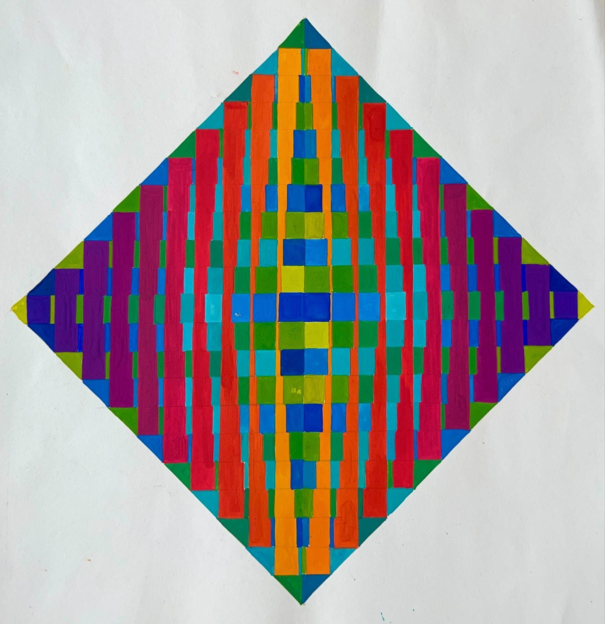
Chromatic Convergence II
2018 | Gouache | 21 × 21 cm
Chromatic Convergence II explores the interaction of geometric form and colour through layering, variation, and spatial tension.
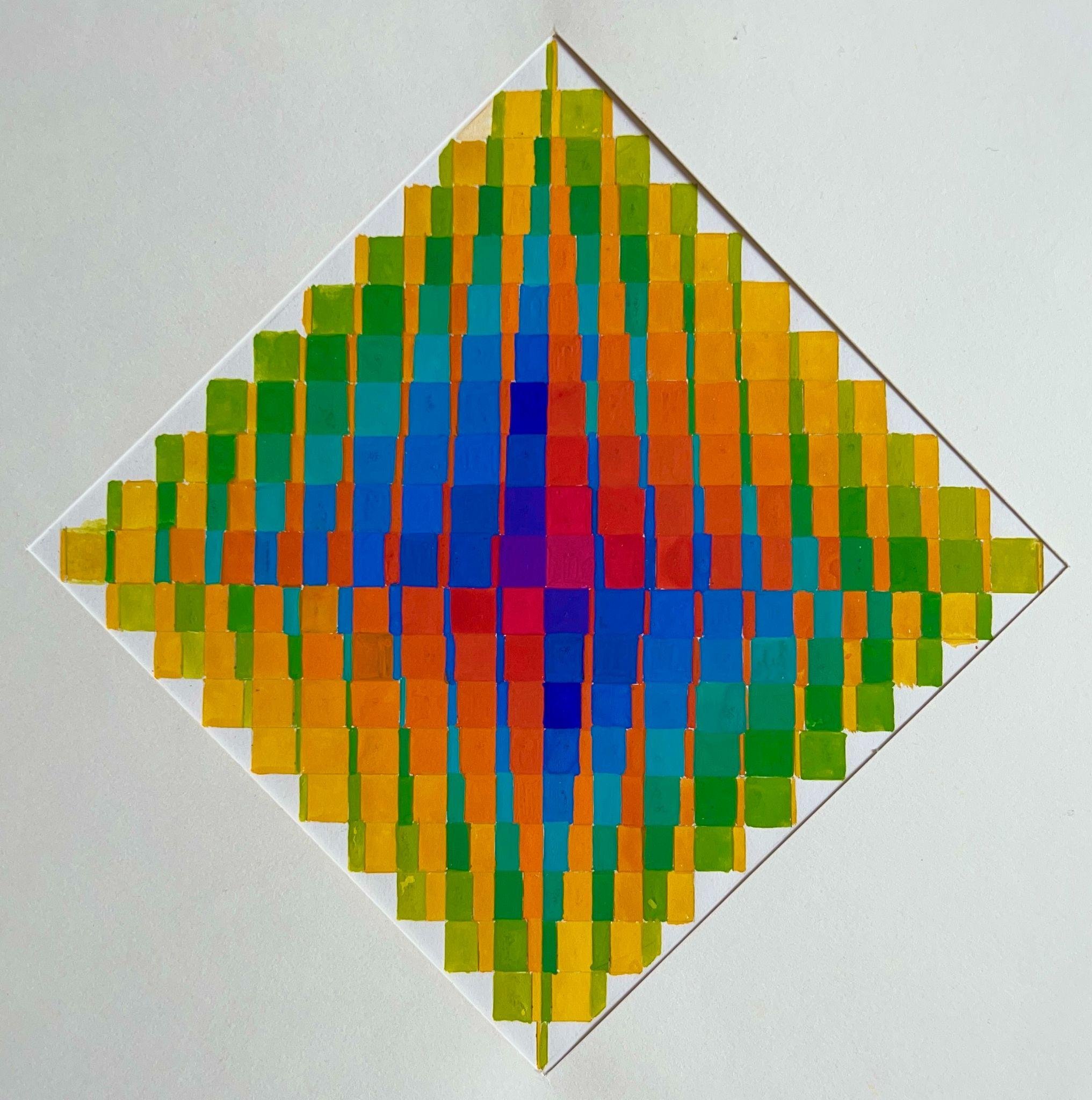
Chromatic Convergence III
2017 | Gouache | 21 × 21 cm
Chromatic Convergence III examines how repetition and chromatic contrast create rhythm, depth, and visual balance.
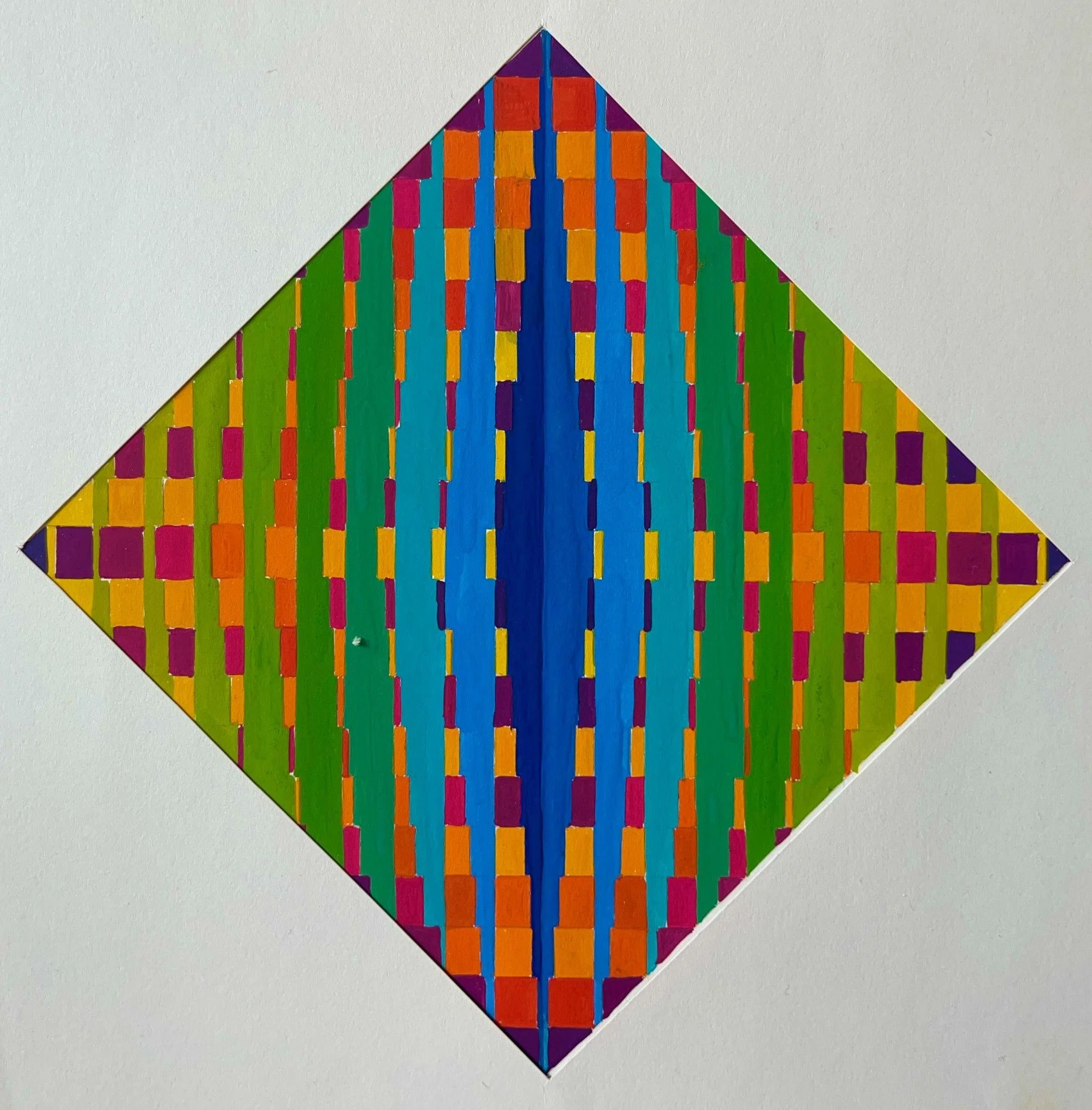
Chromatic Convergence IV
2016 | Gouache | 21 × 21 cm
Chromatic Convergence IV investigates the transformation of geometric structures through colour, overlap, and shifting spatial relationships.
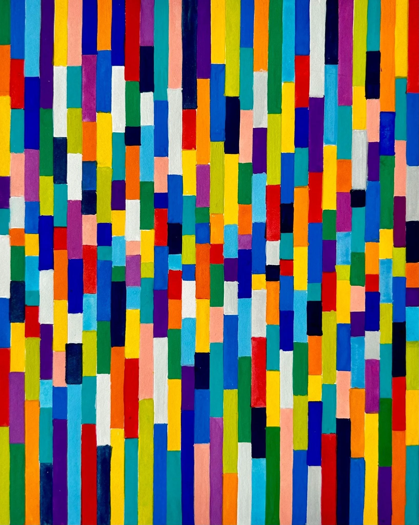
Composition
2014 | Gouache | 15 × 19 cm
Composition explores how small elements and vibrant colours create balance, movement, and visual focus through variations in height, length, direction, and colour.
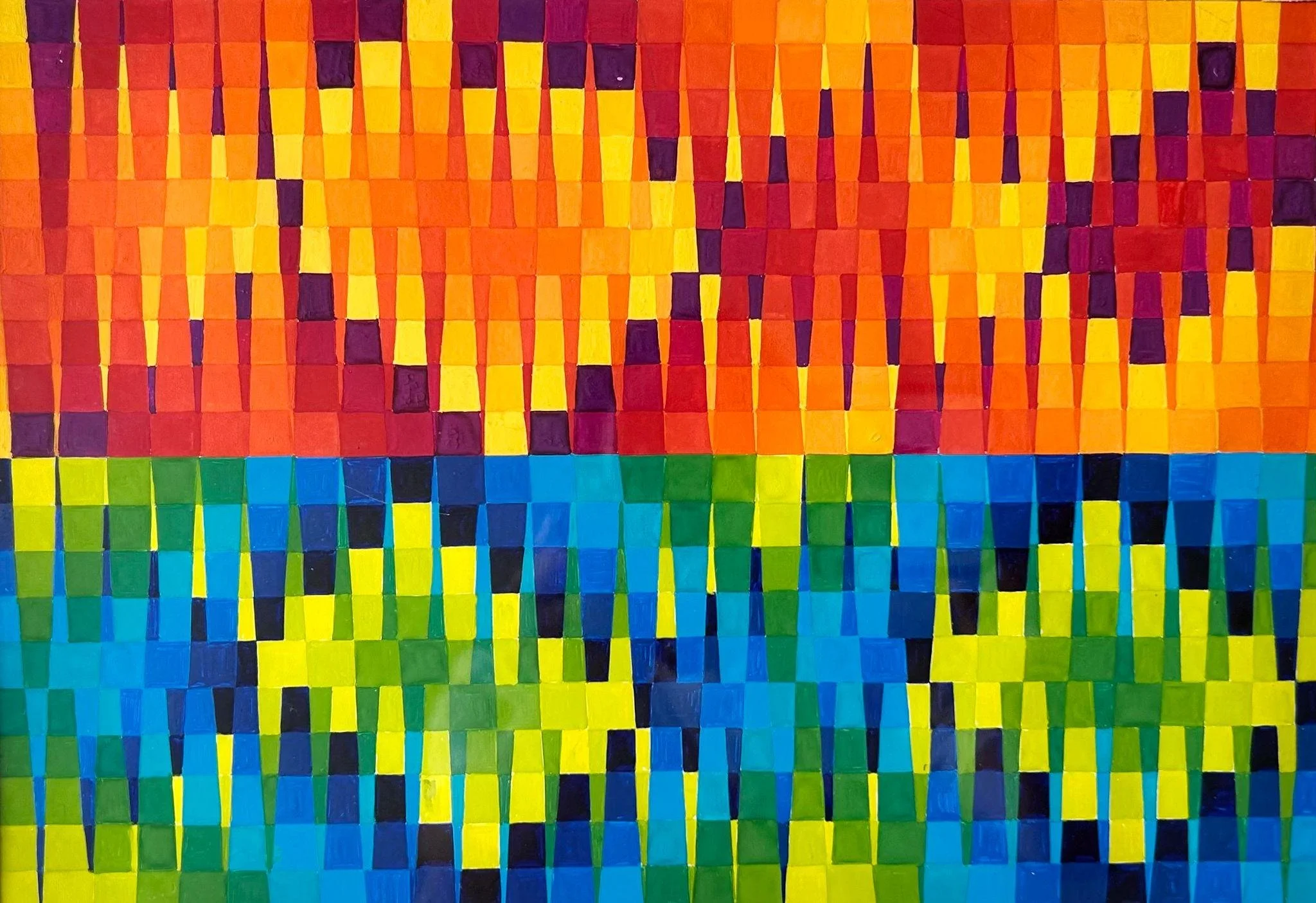
Chromatic Dialogue
2010 | Gouache | 20 × 25cm
Chromatic Dialogue investigates how the juxtaposition of warm and cool colour fields creates rhythm and spatial relationships through repetition, variation, contrast, and vertical division.
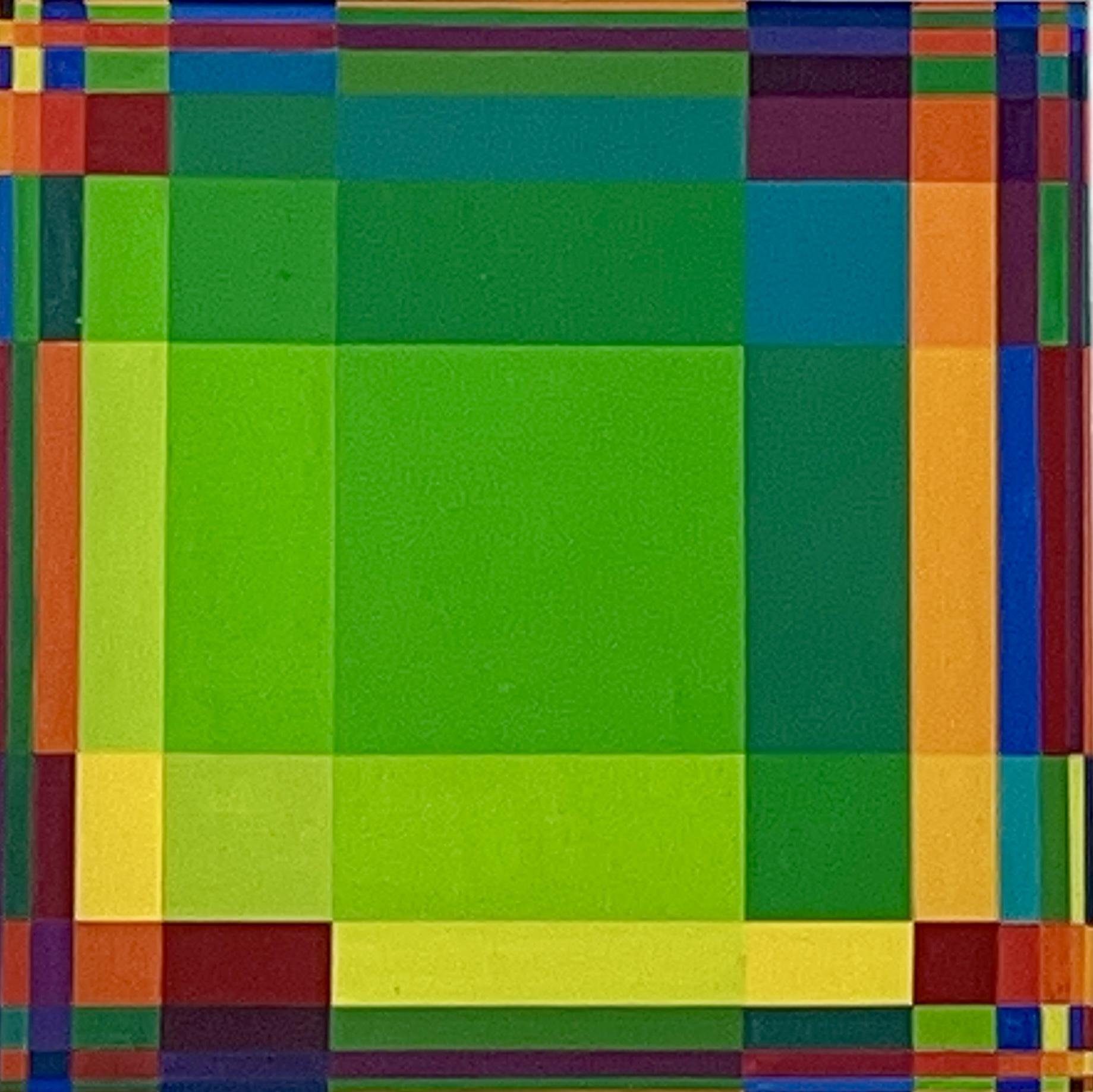
Inner Expansion
2009 | Acrylic | 25 × 25 cm
Inner Expansion explores spatial expansion and contraction through colour, proportion, and the relationship between the central and surrounding spaces.
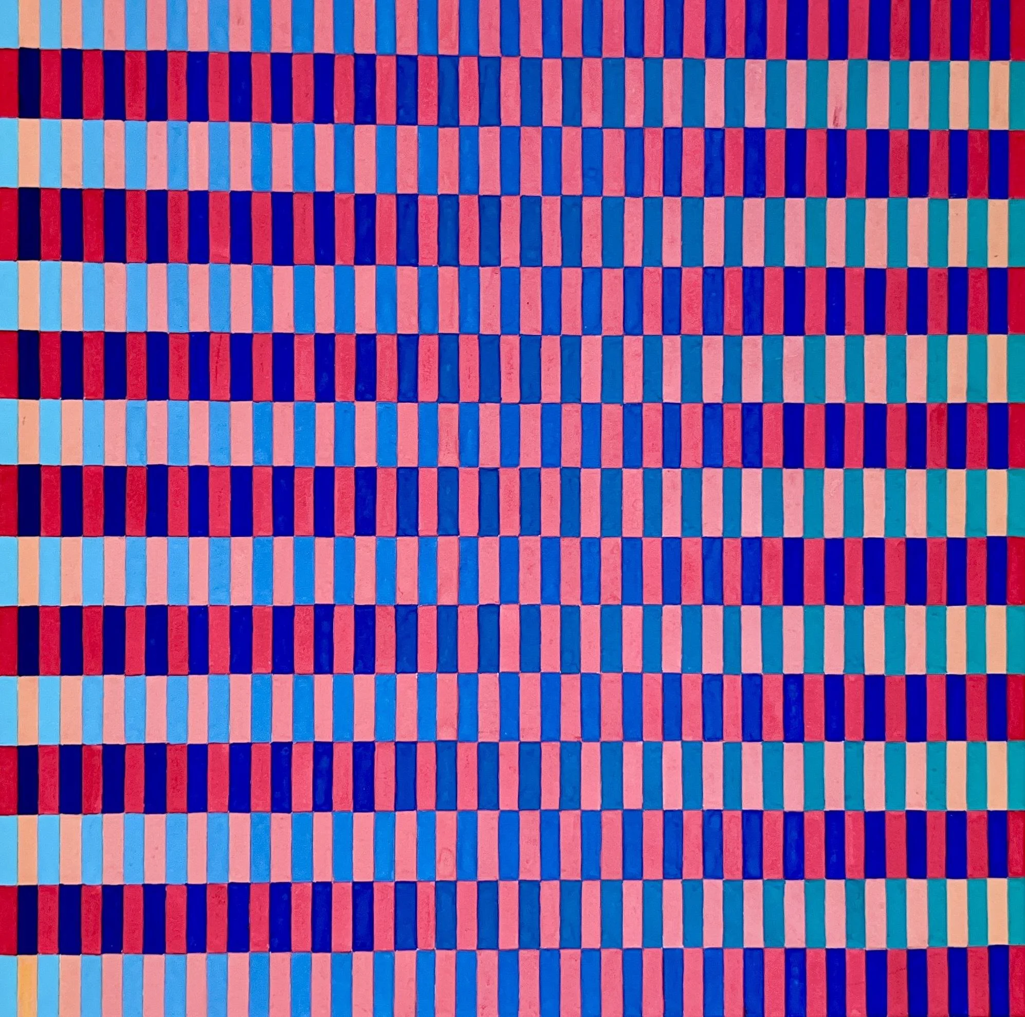
Chromatic Equilibrium
2008 | Gouache | 25 × 25 cm
Chromatic Equilibrium investigates how contrasting warm and cool colour relationships interact within a repeated geometric structure to create visual balance, tension, and perceptual depth.
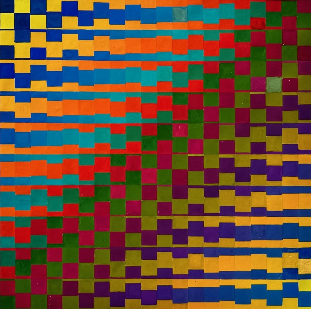
Chromatic Transformation
2007 | Gouache | 24 × 24 cm
Chromatic Transformation investigates how gradual shifts in colour and the expansion and contraction of geometric forms can evoke the cyclical movement of breathing, transforming bodily experience into an abstract visual language.
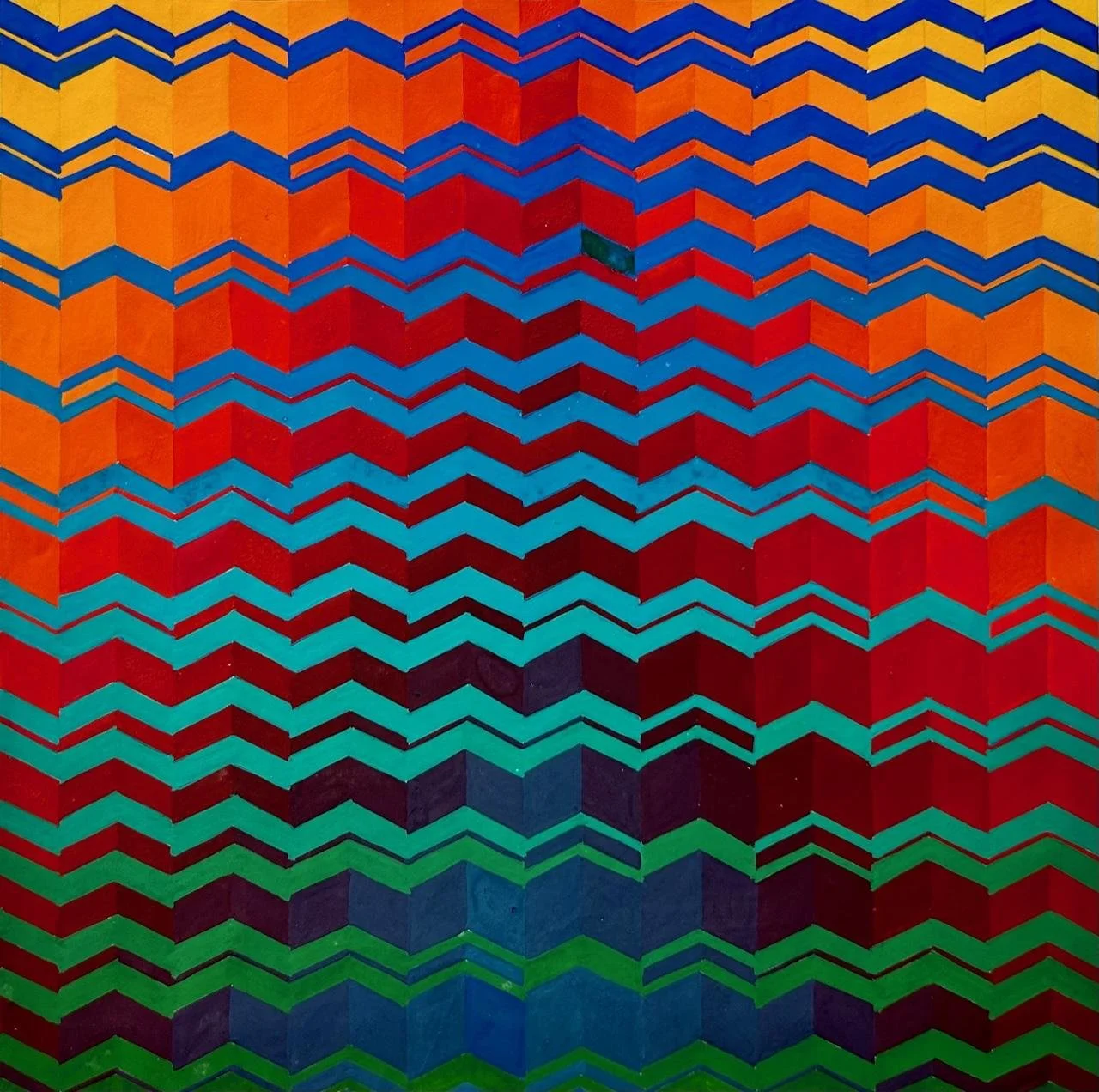
Chromatic Waves
2006 | Gouache | 24 × 24 cm
Chromatic Waves investigates how wave-like forms and gradual transitions from blue to green interact with a warm field of yellow, orange, and red, creating relationships between movement, colour contrast, depth, and spatial perception.
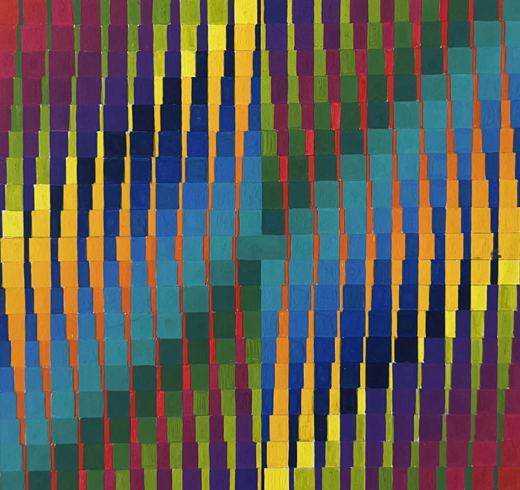
Chromatic Intersection
2005 | Gouache | 25 × 25 cm
Chromatic Intersection investigates how intersecting linear structures and contrasting colour progressions—from red through violet and blue to green, alongside shifts from red through yellow to green—create relationships between colour, form, and spatial perception.
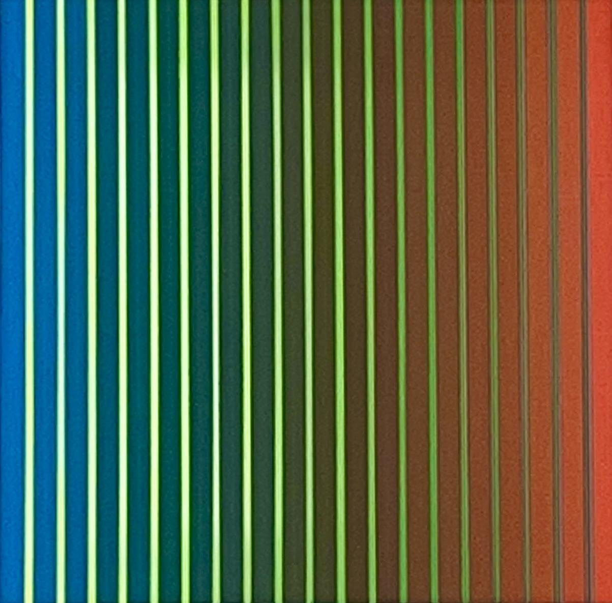
Linear Variations I
2004 | Acrylic | 24 × 24 cm
Linear Variations I investigates how a consistent linear structure can generate different visual relationships through changes in colour, proportion, and chromatic contrast.
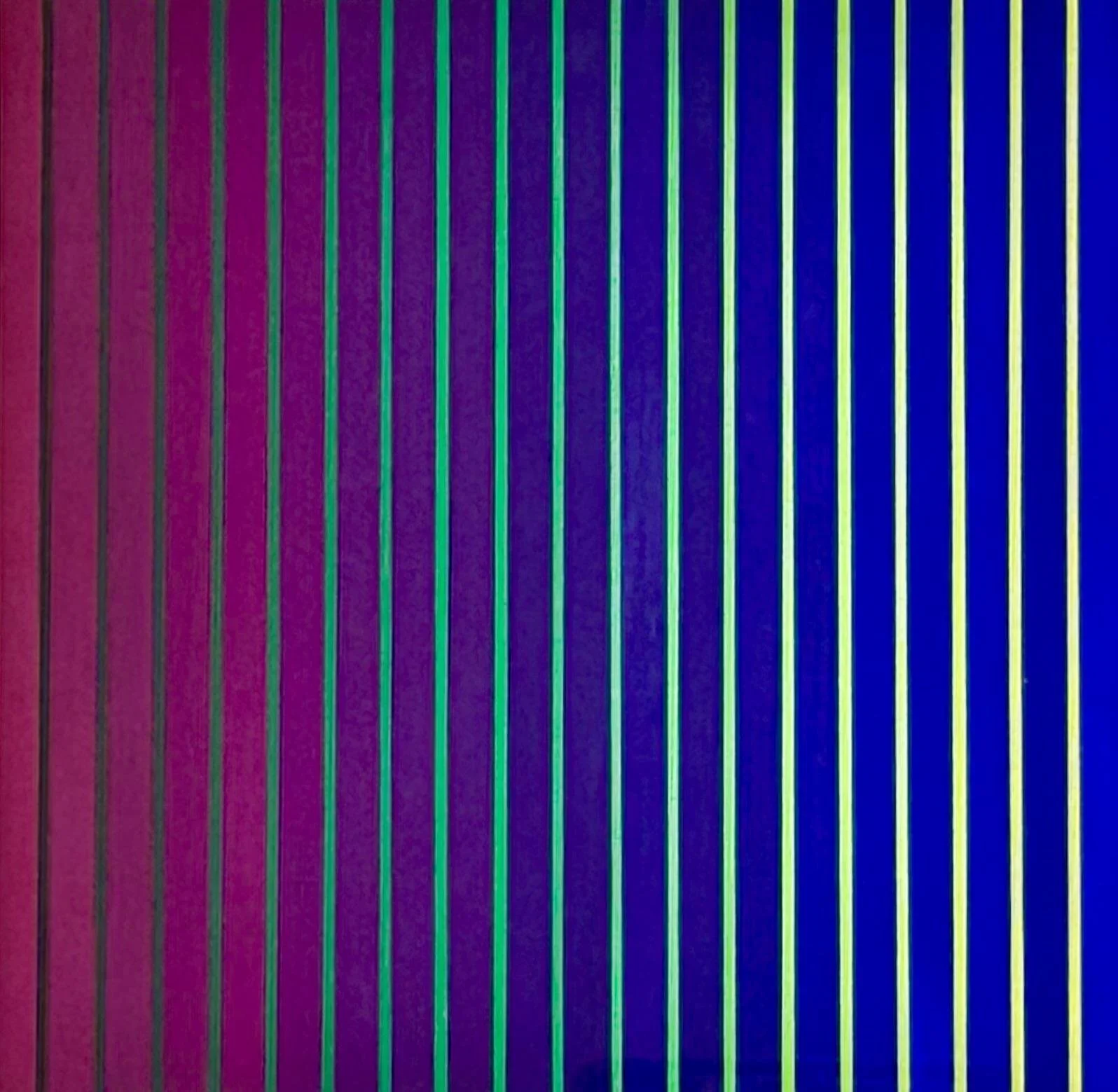
Linear Variations II
2003 | Acrylic | 24 × 24 cm
Linear Variations II investigates how the same linear structure can produce a different perceptual experience through shifts in colour relationships, tonal progression, and contrast.
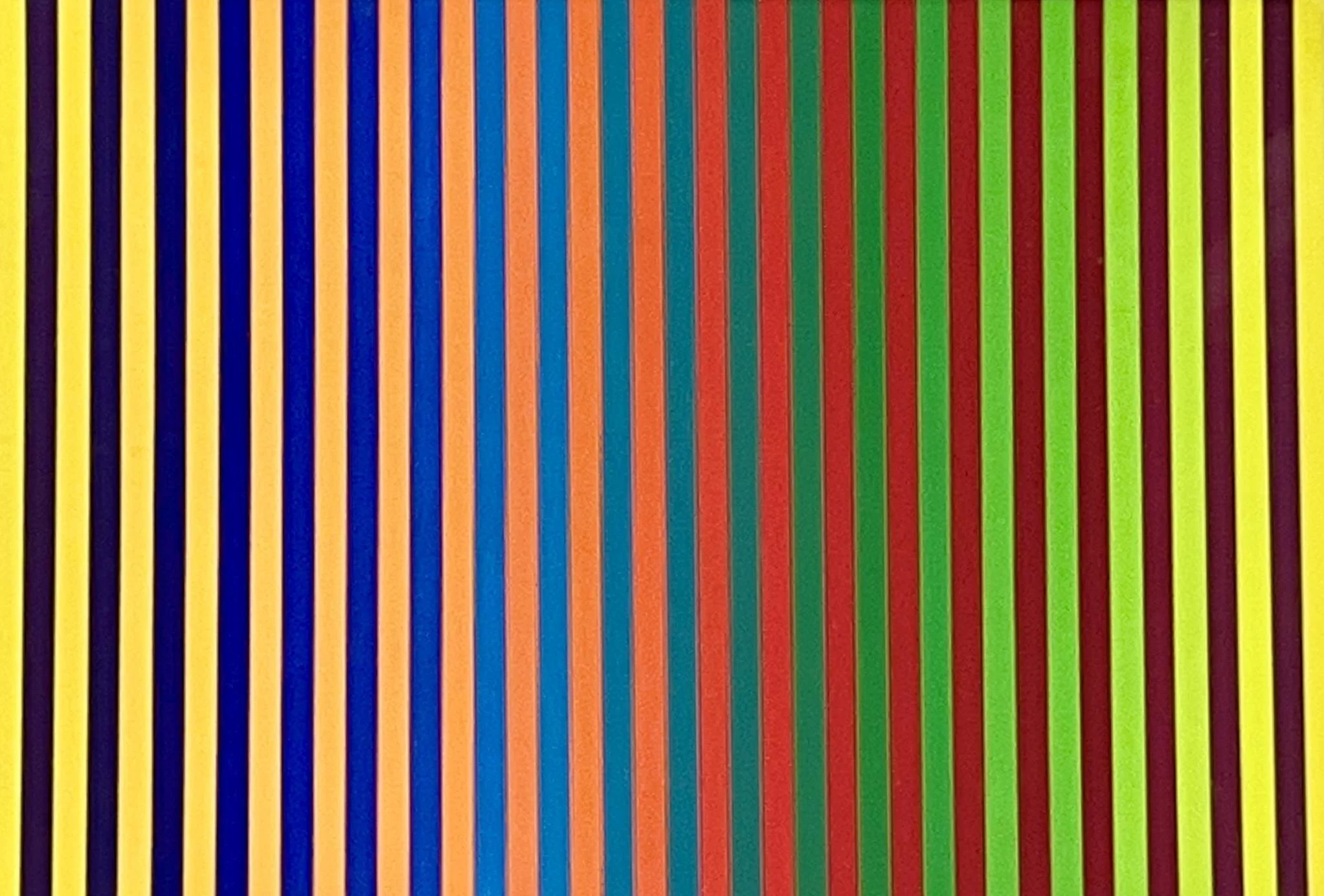
Linear Contrast
1999 | Acrylic | 301 × 25 cm
Linear Contrast explores how alternating warm and cool colours within a repeated linear structure influence visual balance and spatial perception.
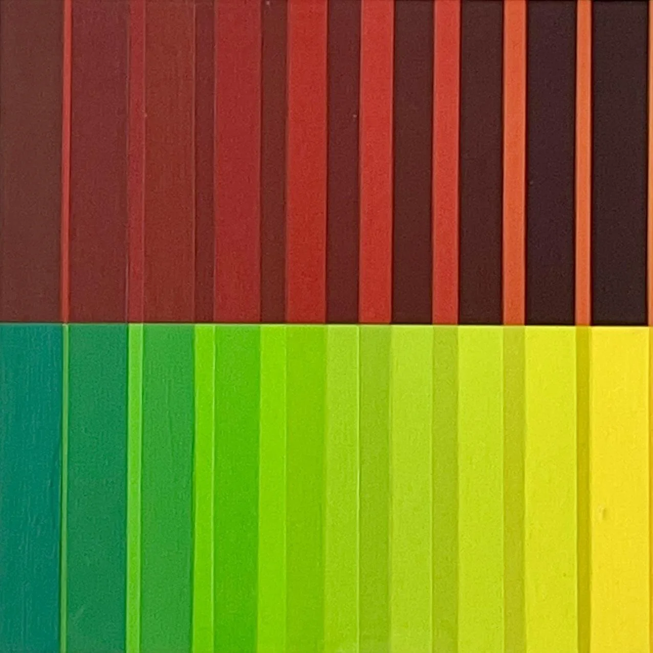
Linear Division I
1997 | Acrylic | 24 × 24 cm
Linear Division I explores how warm and cool colour relationships are organised within a consistent linear structure, creating differences in proportion, contrast, and spatial perception.
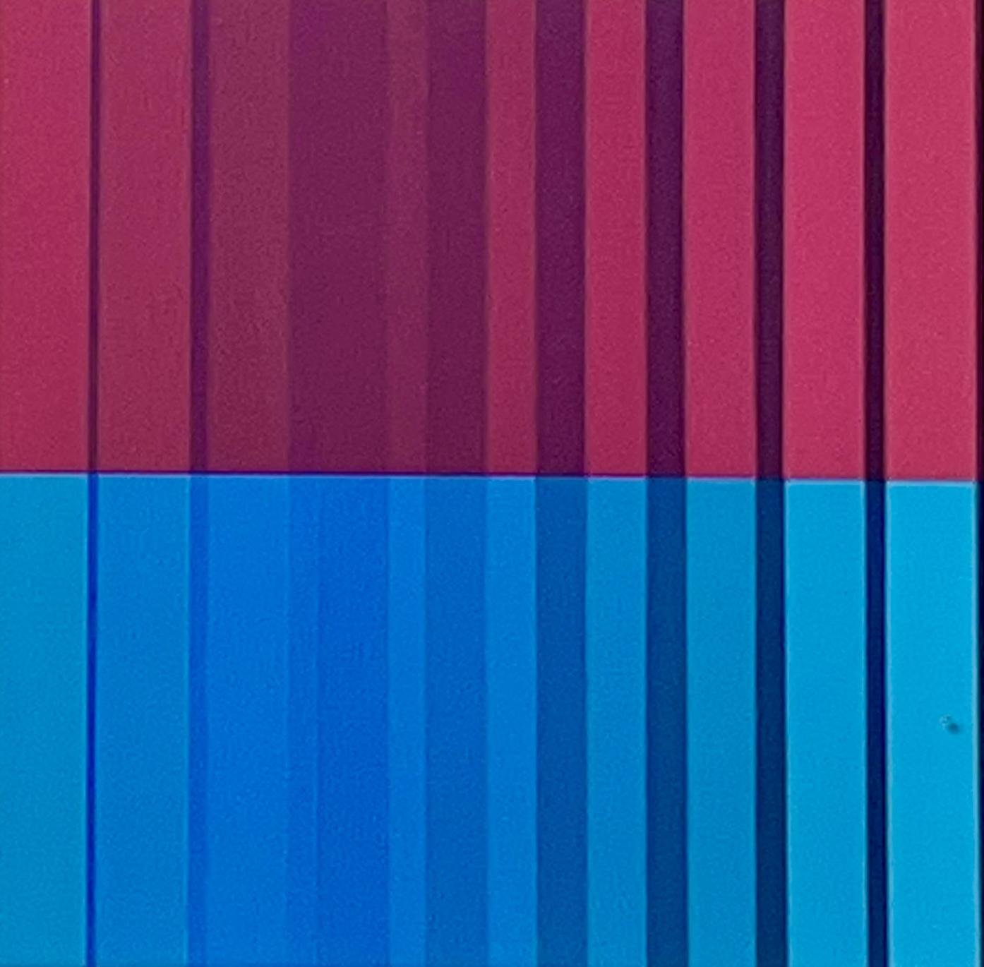
Linear Division II
1997 | Acrylic | 24 × 24 cm
Linear Division II investigates how a different colour progression within the same linear structure alters relationships of contrast, proportion, and spatial perception.
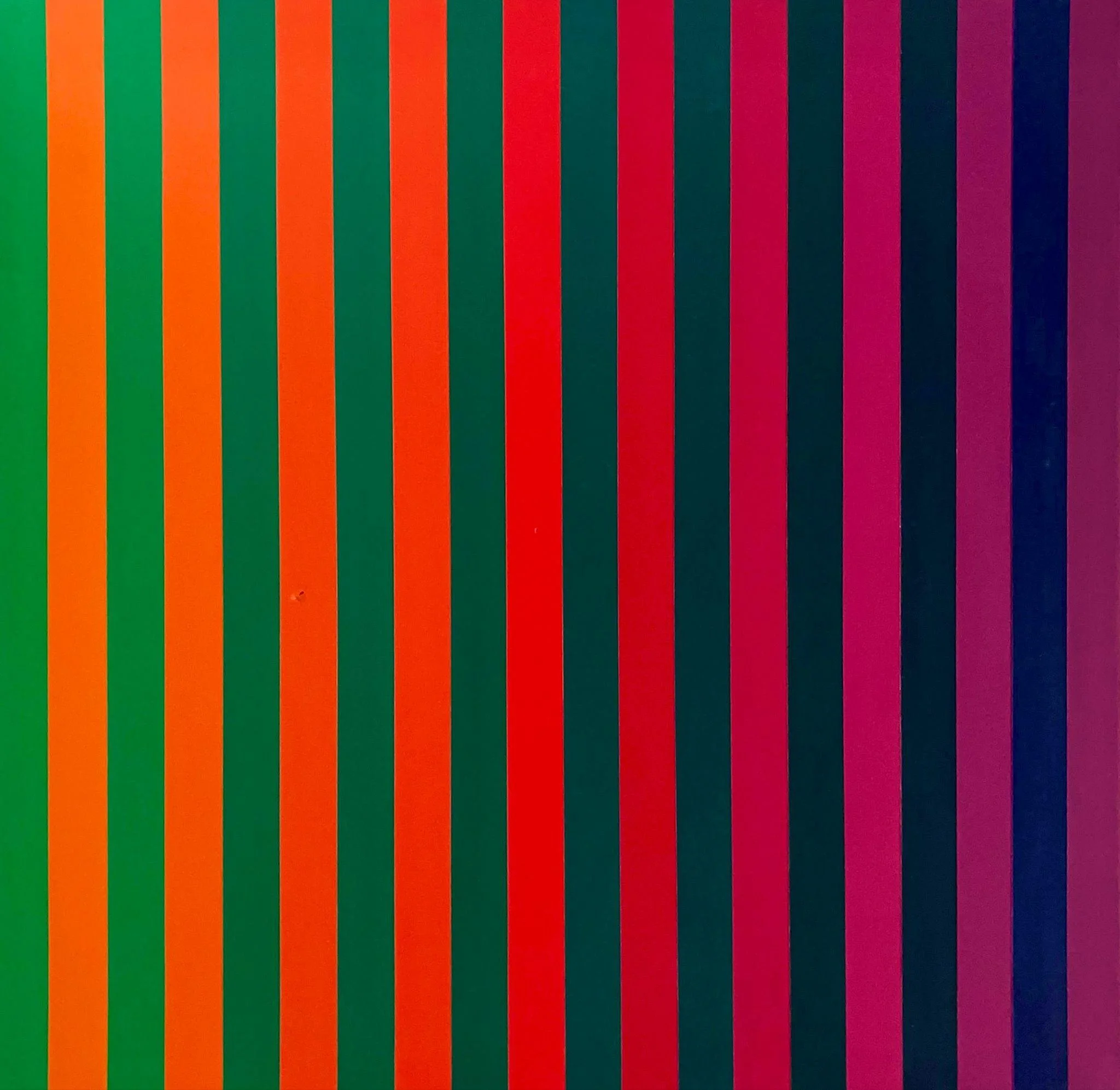
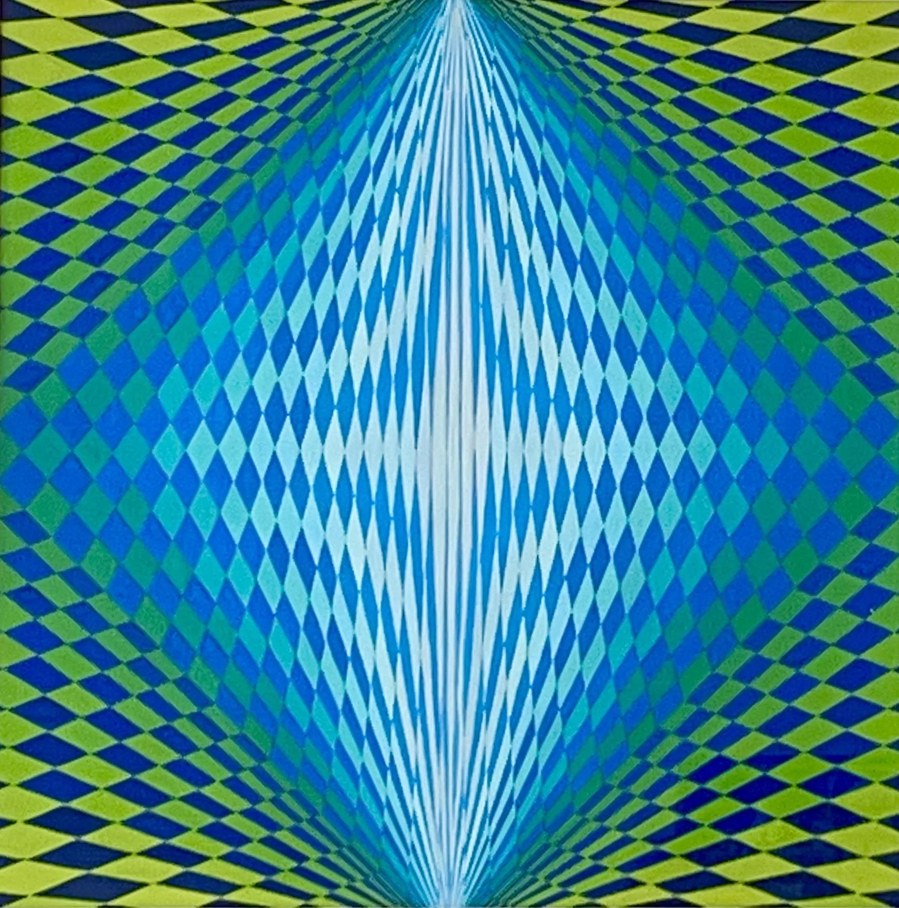
A Field of Coolness
2013 | Gouache | 24 × 24 cm
A Field of Coolness investigates the relationship between cool colour fields and geometric structure through layering, variation, and spatial balance.
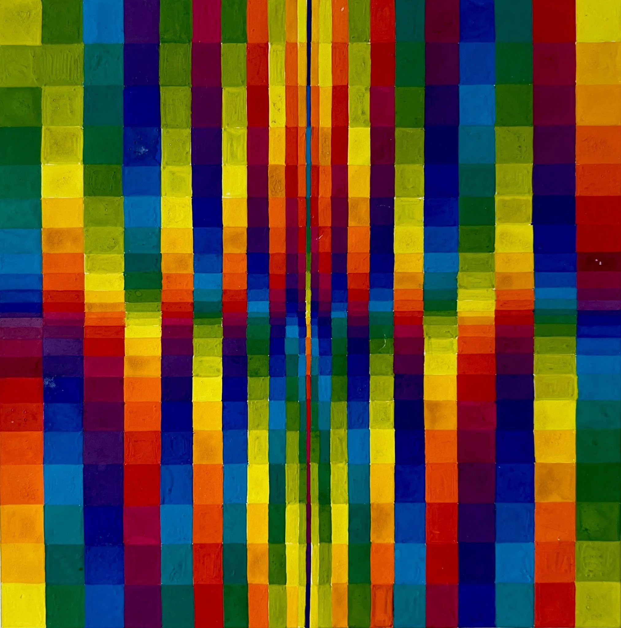
Spectral Light
2012 | Gouache | 25 × 25 cm
Spectral Light investigates the relationship between colour and light through layered chromatic forms and spatial compression.
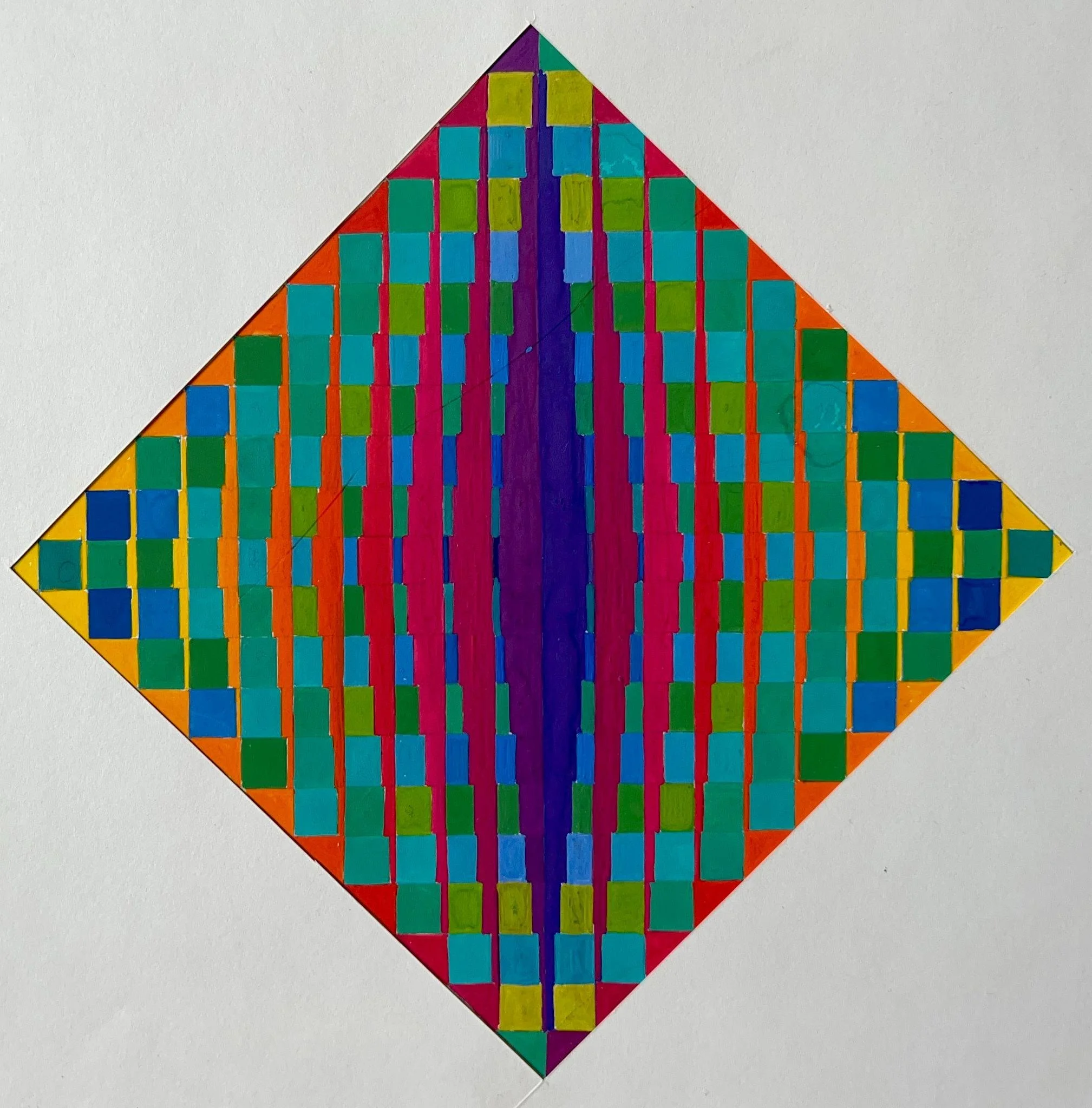
Chromatic Convergence V
2015 | Gouache | 21 × 21 cm
Chromatic Convergence V explores the relationship between colour, geometric form, and spatial balance through repetition, fragmentation, and visual rhythm.
Linear Counterpoint
1992 | Acrylic | 80 × 80 cm
Linear Counterpoint explores how contrasting colour progressions interact within a simple linear structure, creating differences in visual intensity and perception.
CREA, 1993 — Open-Ended Construction System
Colour · Geometry · Material · Visual Systems · Interaction
crea is an early practice-based construction system developed in 1993. It explored how combinable physical elements, colour, geometry and visual organisation could generate multiple forms through assembly, rearrangement and transformation.
Developed collaboratively with my father, Professor Hein, the project involved my substantial contribution to its development and design, particularly in the areas of visual identity, logo, colour system, graphic language, leporello and packaging, instructions, project texts, and exhibition presentation.
The open-ended structure of crea did not prescribe a single final form. Instead, it established conditions through which different configurations could emerge through interaction and reconstruction.
crea was not conceived as doctoral research and is not presented retrospectively as an established TCFM methodology. Its relevance to my current research is developmental: it provides an early example of my continuing interest in the relationship between structure, material, visual organisation, interaction and transformation.
Following my father's death, I have continued to carry the project forward as part of my practice and to reconsider its significance from the perspective of my current research.
Complete system: overall view of the crea construction system.
–––––––––––
02
Physical Elements: Material, geometry and individual components.
–––––––––––
03
Combinations and Configurations: Examples of assembly, rearrangement and transformation.
–––––––––––
04
Visual Identity: Logo, colour system and graphic language.
–––––––––––
05
Leporello and Packaging: Printed communication and presentation of the system.
–––––––––––
06
Presentation: exhibition and presentation documentation.
–––––––––––
07
Presentation: exhibition details.
–––––––––––
08
Hamburger Abendblatt Journal, 27./28. November 1993
Historical Documentation
Contemporary newspaper documentation, 1993
A contemporary newspaper article documents crea and its public presentation. The original article is included here as supporting evidence of the project's historical context and development.
–––––––––––
01